Shaded logos that use gradients and shading have, historically, been avoided because they aren’t shown at their best when printed in black and white, but as the web has evolved and become used more and more by businesses (and especially with the emergence of companies that only operate online), shaded logos are coming back with a vengeance.
Shading and gradients can add a depth to a logo, and can help to make the mark “pop” a bit more. It’s a very useful technique to be able to lift part of the logo off the page so that it doesn’t seem quite so flat – but it can be quite challenging to do it effectively and in a way that looks natural. I’ve brought together 30 examples of superbly crafted shaded logos that make use of gradients & shading to improve and define the logo – hopefully this collection will inspire you with your next logo design.
And for even more logo inspiration, check out another article about inspiring logo design on Design Woop.
Table of Contents
- S Logo
- Crumby Creative Logo
- LG Shaded Impossible Shape Monogram
- Shopanalyst Logo
- Yuvod Logo
- Windwhirl
- BB
- Toucan Logo Design Exploration
- Payment System Logo Proposal
- Letter T Exploration
- Payment System Shaded Logos
- CreateStudio
- Heart + Hook Logo
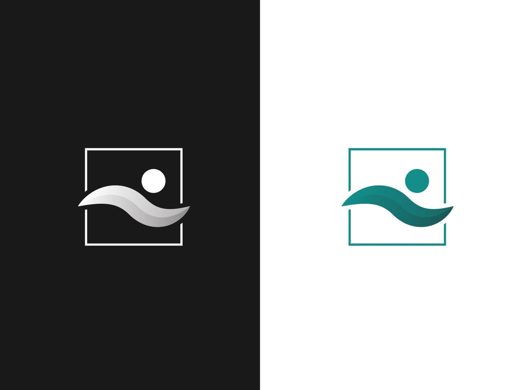
- Payment System
- Letter Y
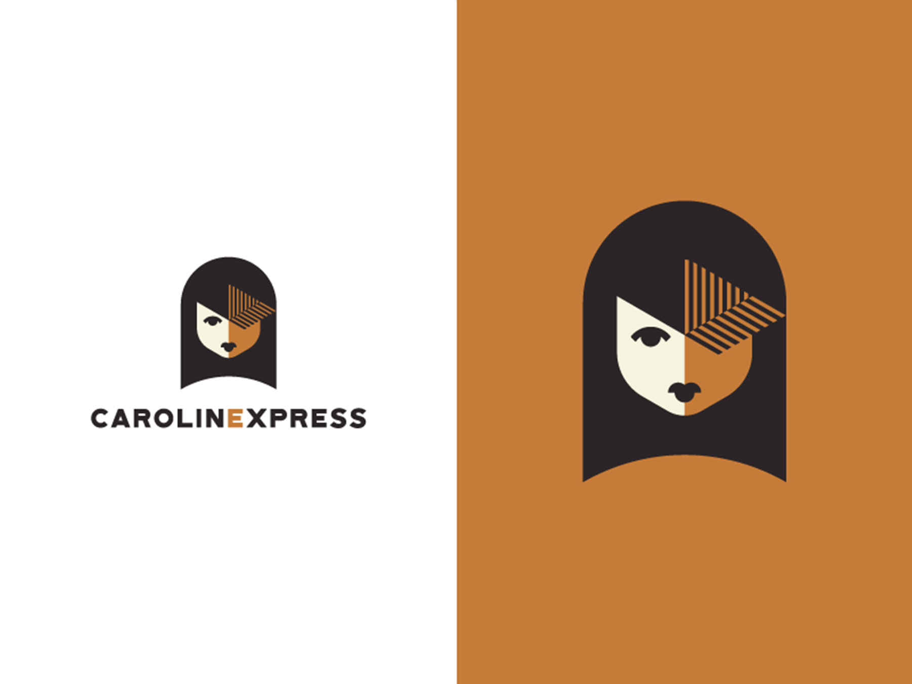
- Caroline
- EC
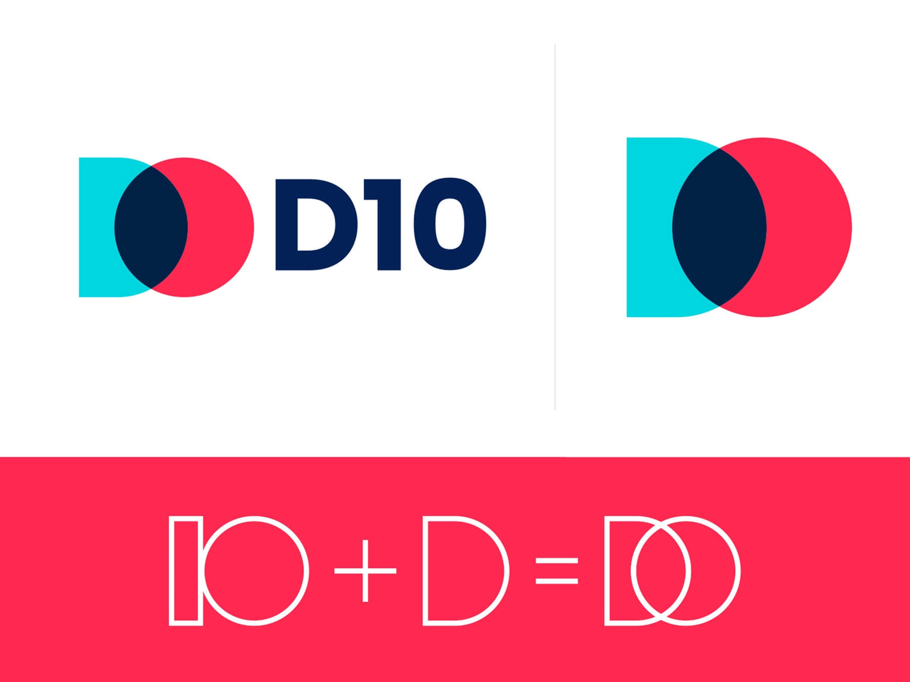
- D + 10
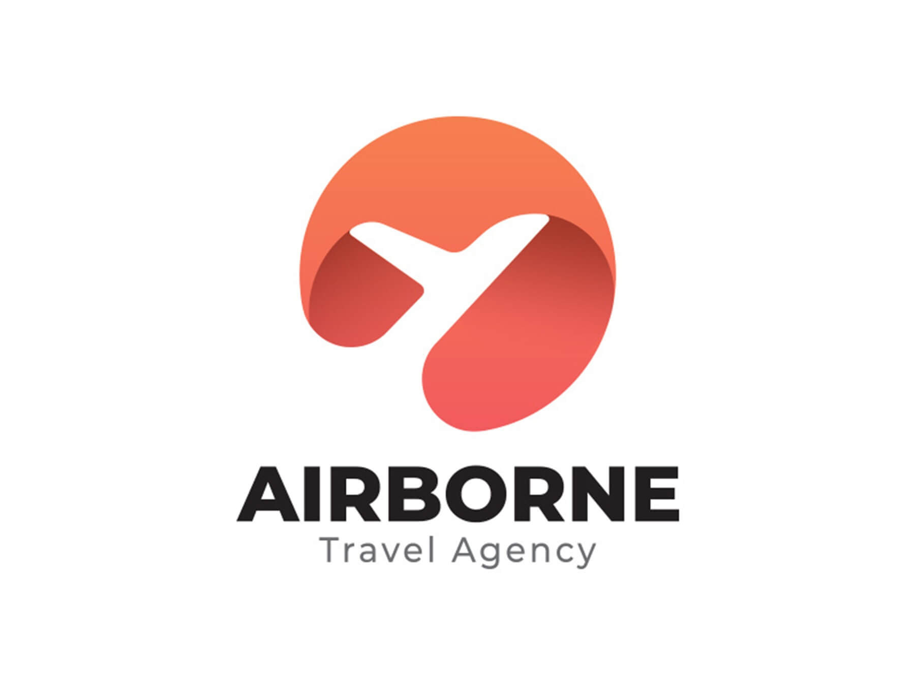
- Airborne Travel Agency Logo
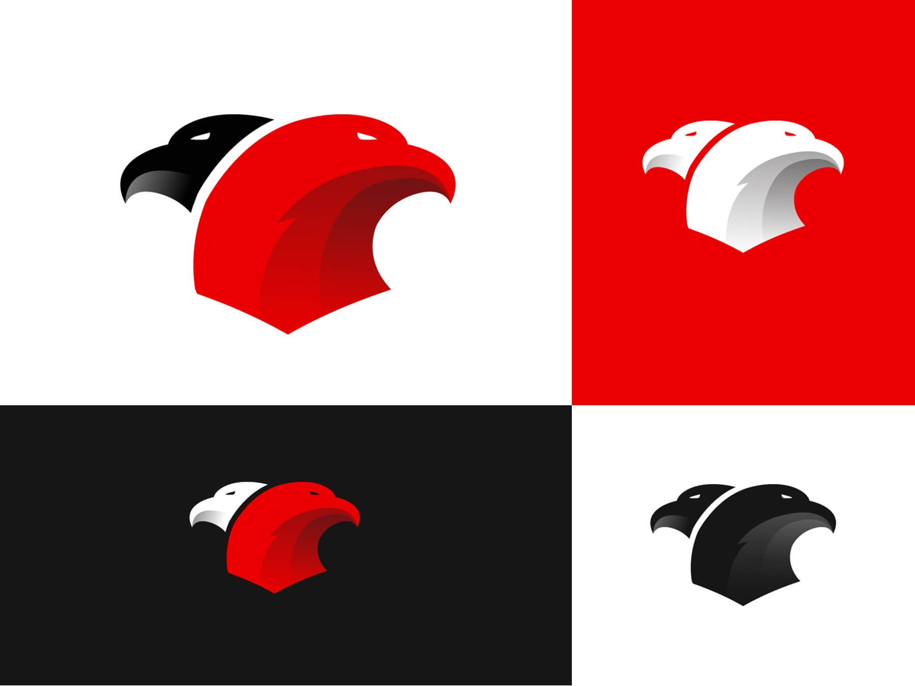
- Eagle Logo
- A P
- P Monogram Logo Idea
- Human Minimal Logo
- Propeller
- Lotus
- CFO Club
- Medusa
- 25°
- Valiance
- Leaf logo
S Logo
Crumby Creative Logo
LG Shaded Impossible Shape Monogram
Shopanalyst Logo
Yuvod Logo
Windwhirl
BB
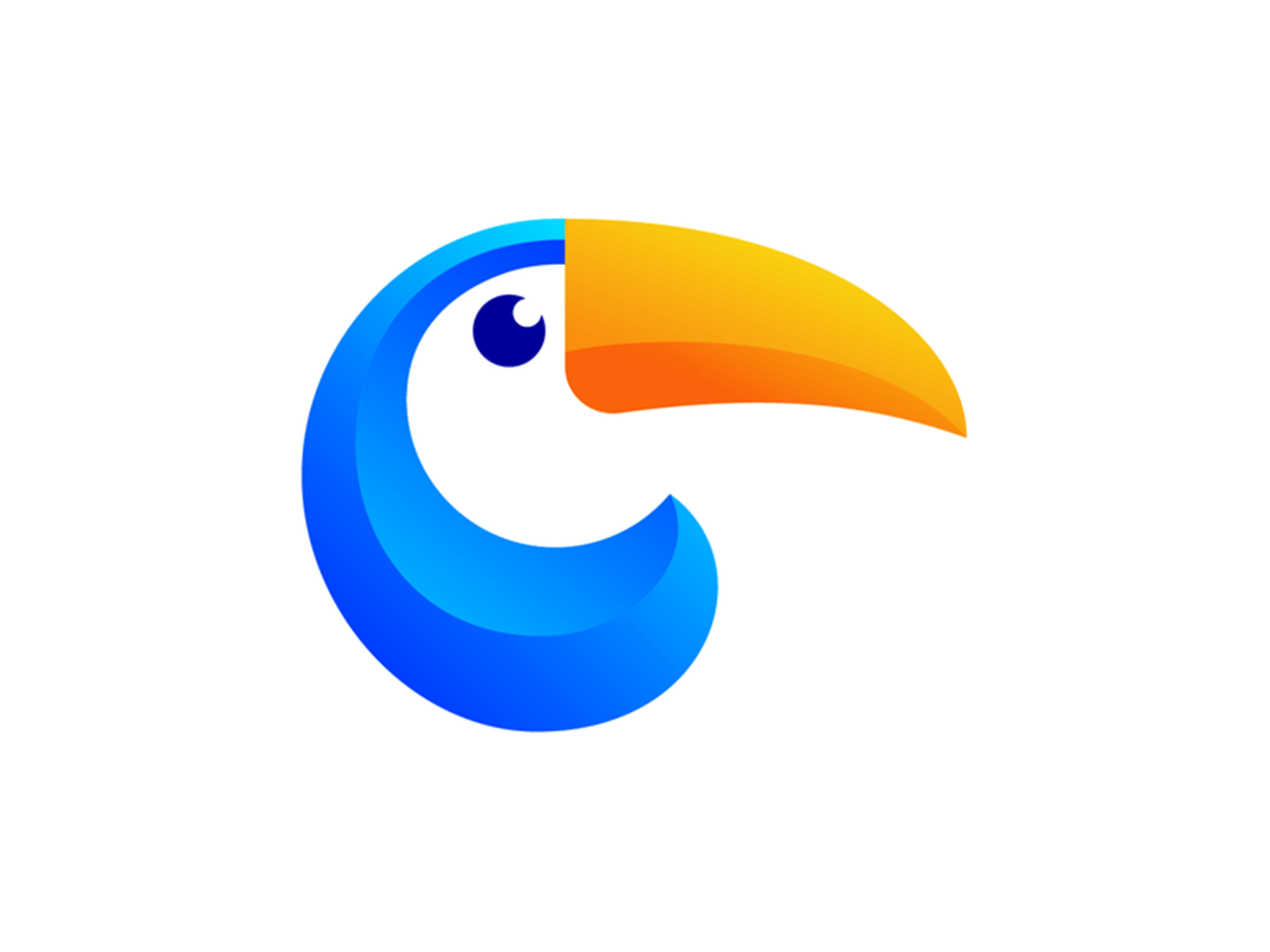
Toucan Logo Design Exploration
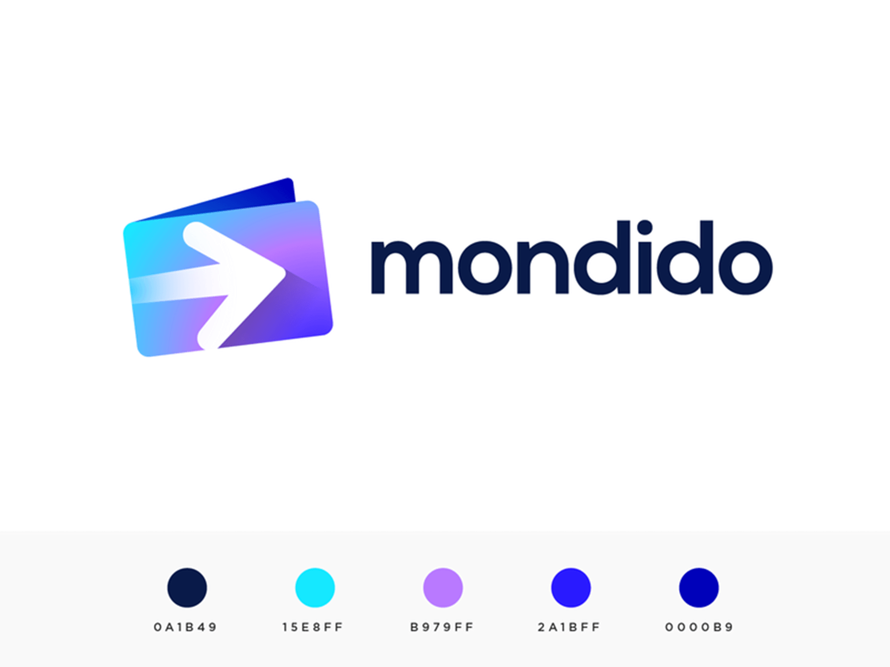
Payment System Logo Proposal
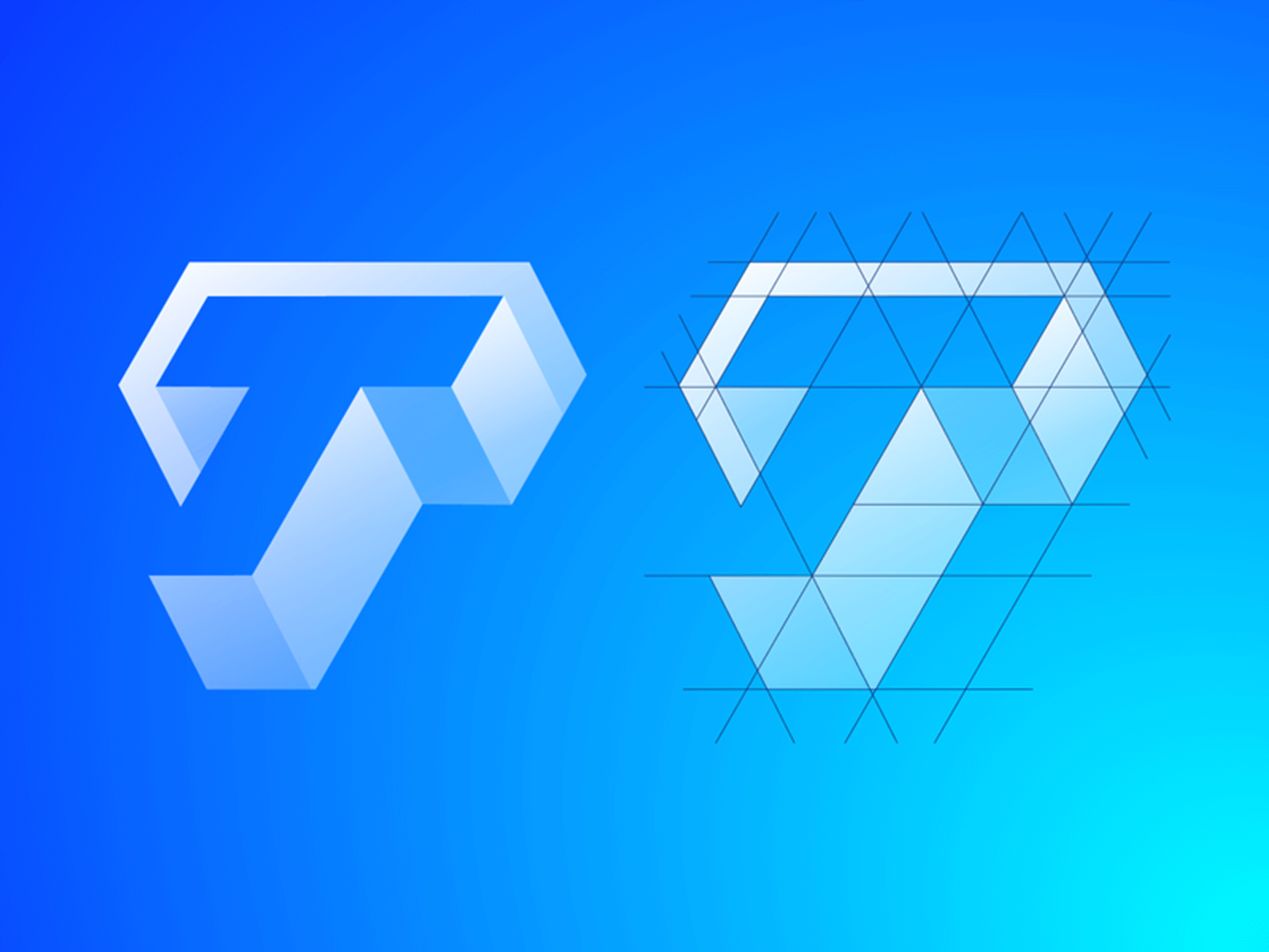
Letter T Exploration
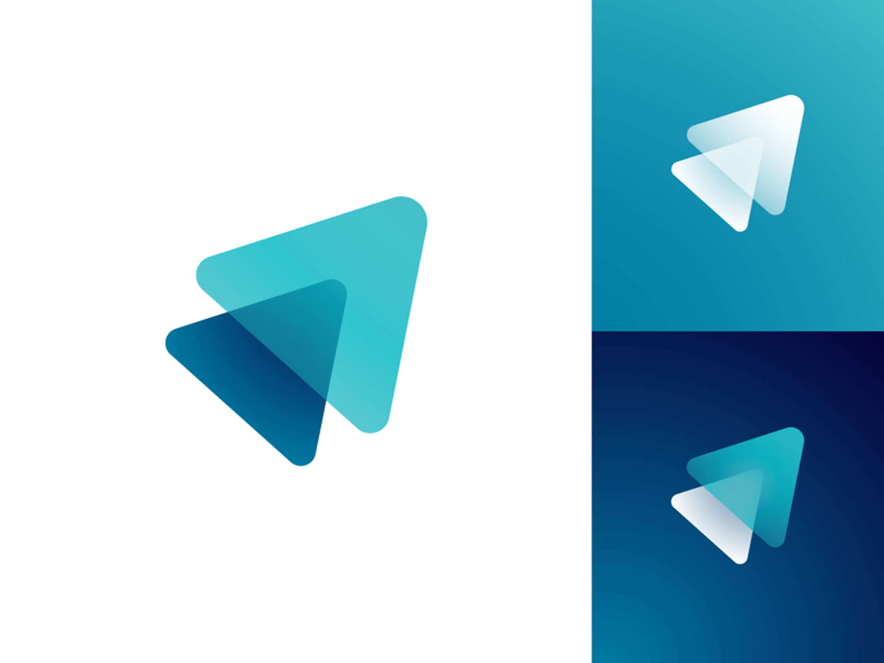
Payment System Shaded Logos
CreateStudio
Heart + Hook Logo
Payment System
Letter Y
Caroline
EC
D + 10
Airborne Travel Agency Logo
Eagle Logo
A P
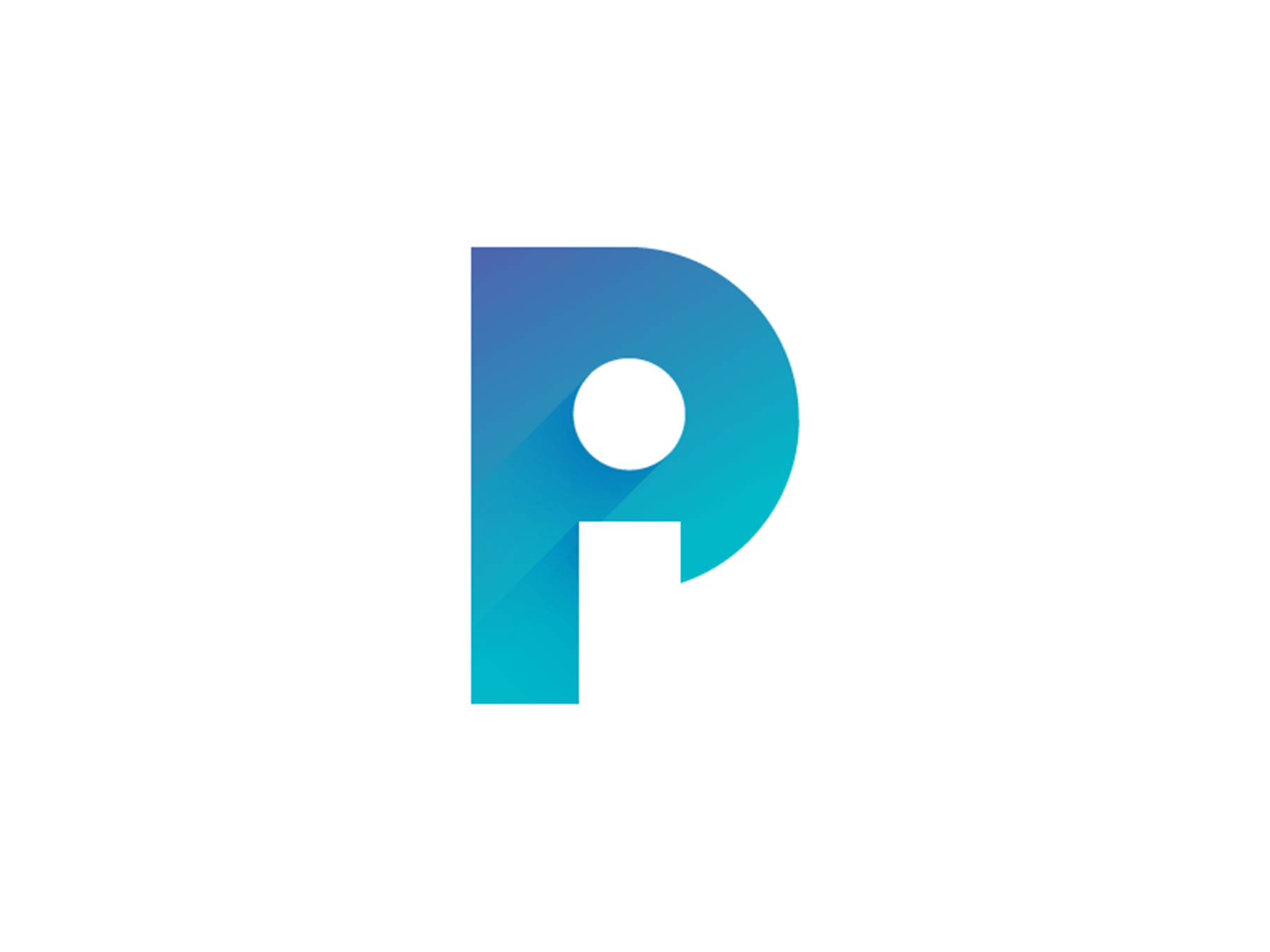
P Monogram Logo Idea
Human Minimal Logo
Propeller

Lotus
CFO Club
Medusa
25°
Valiance
Leaf logo