 Best SEO Companies
In the past few years the rise of mobile devices such as iPads, iPhones and other smart phones was extremely huge and that was the reason why responsive web design started to play more and more important role in the design industry. But what is the responsive design you will ask.
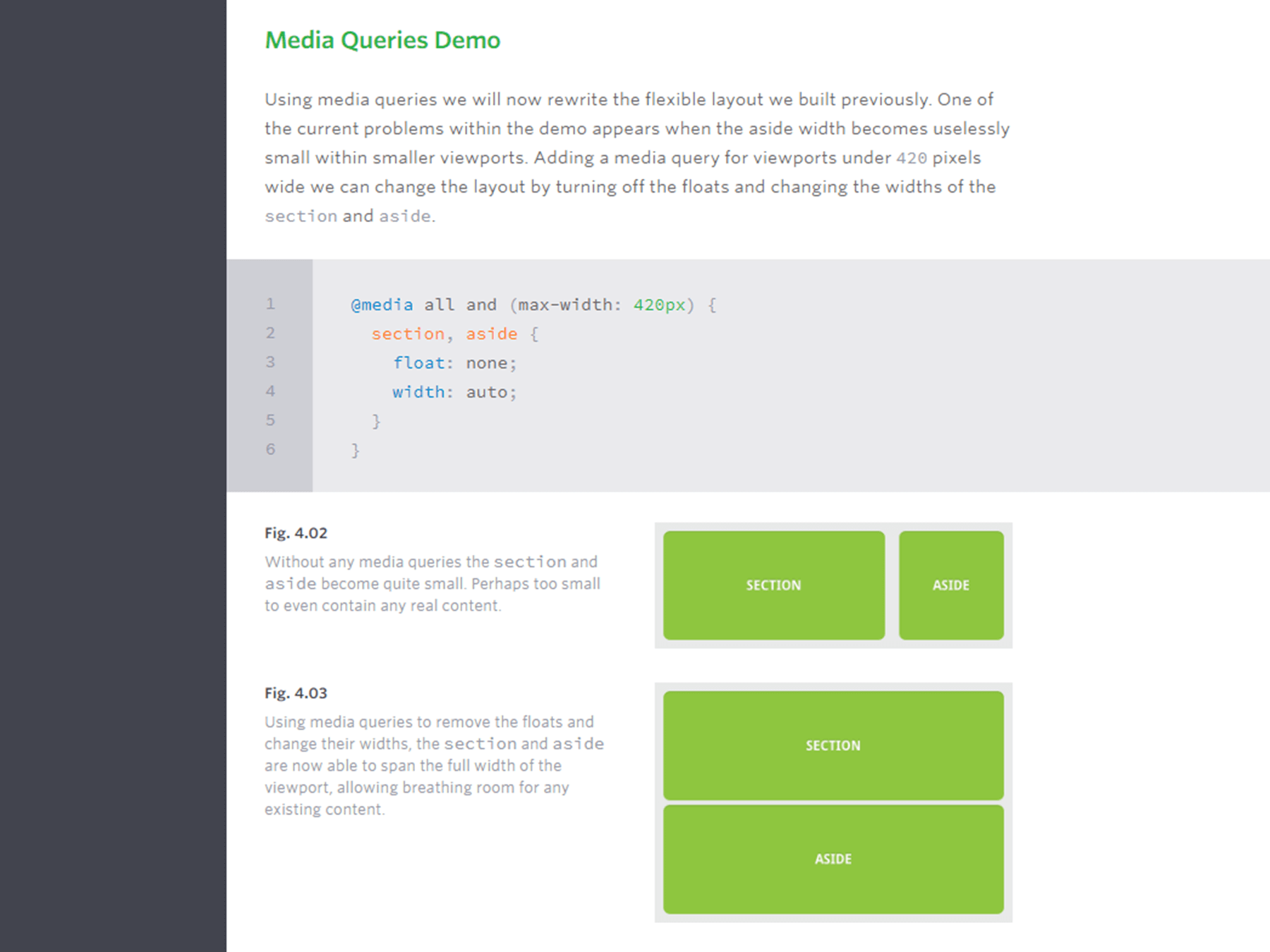
The idea of responsive web design, started by Ethan Marcotte, is that our websites should respond to the device that our page is shown on by adapting their layout and design to fit any device resolution. In his book “Responsive Web Design” he outlines the three parts to a responsive website: a fluid grid, fluid images and media queries.
In this post I would like to share 15 useful responsive design tutorials to help you get started with responsive designing including fluid grids, fluid images and media queries. Some of these tutorials include CSS that we have quite a few articles about. If CSS is in the field of your interest, then we recommend to check out this article about 10 Incredibly Effective CSS HTML Stylish Login Form Page Templates on Design Woop.
Table of Contents
- Responsive Design Tutorial – Learn Responsive Web Design In 5 Minutes
- How to Think Responsively: A Responsive Web Design Tutorial
- Responsive Web Design Basics
- What is Responsive Web Design?
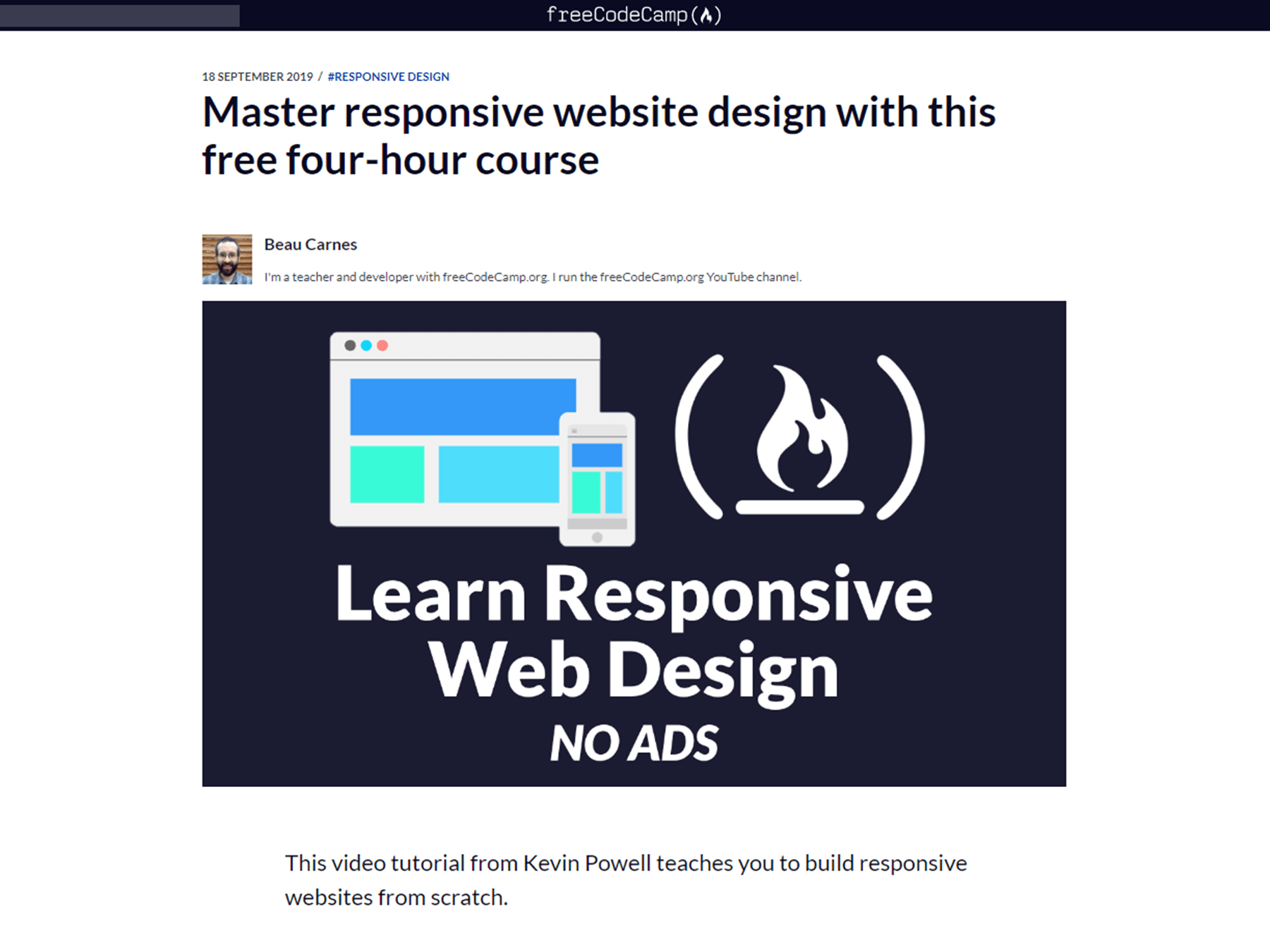
- Master Responsive Website Design With This Free Four-Hour Course
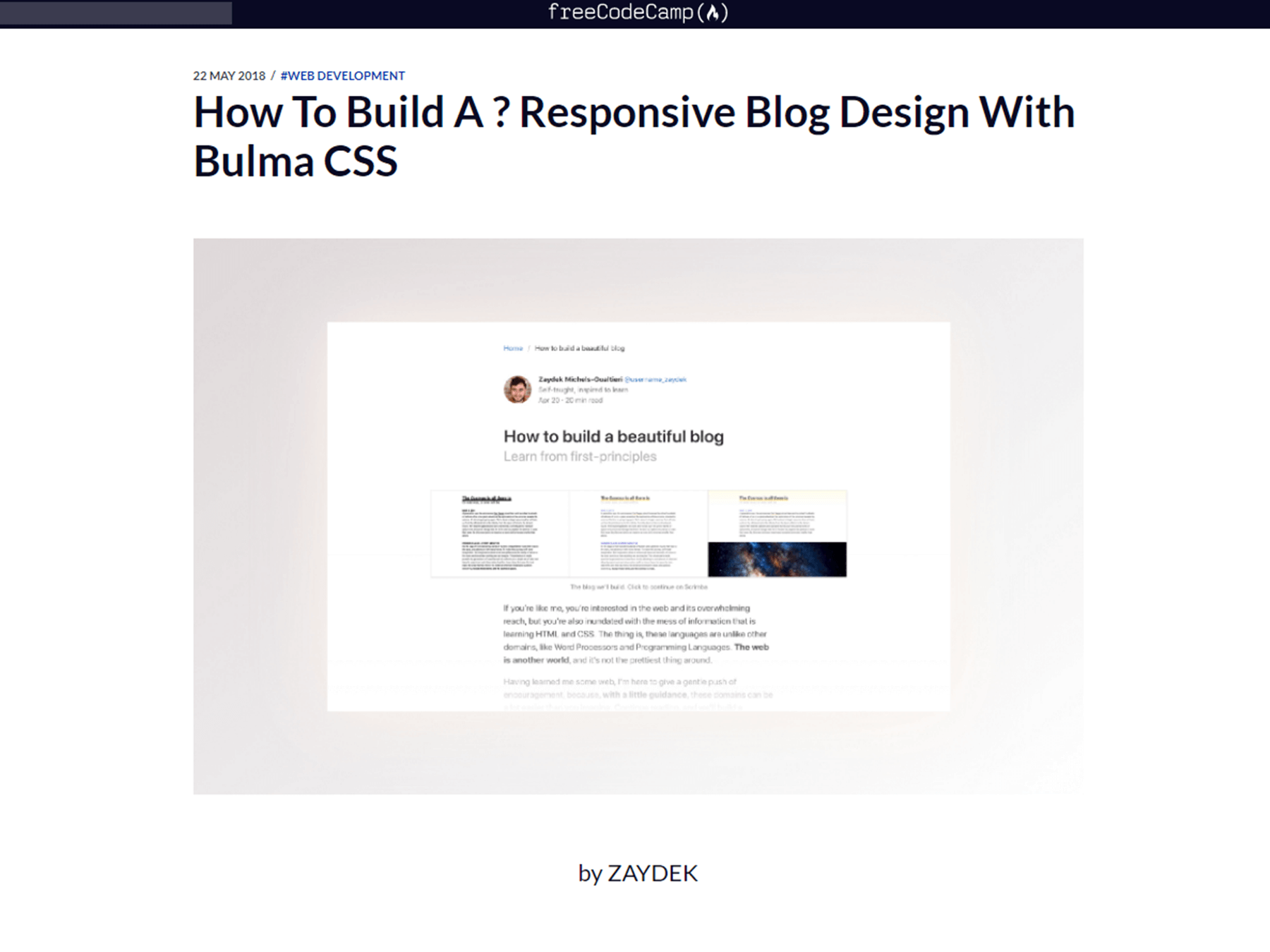
- How To Build A Responsive Blog Design With Bulma CSS
- Responsive Web Design with HTML&CSS
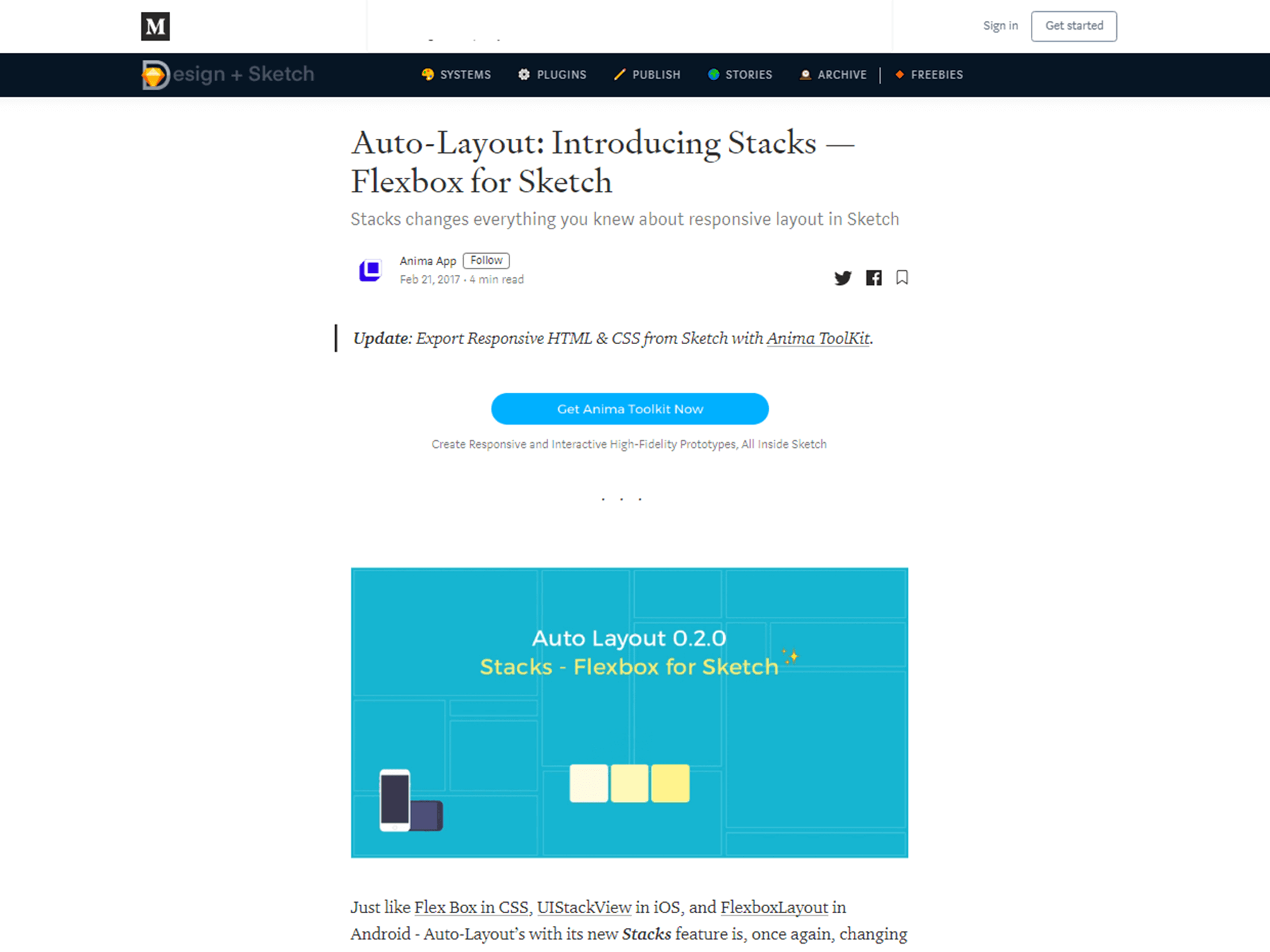
- Auto-Layout: Introducing Stacks — Flexbox for Sketch
- Codrops Flexbox Reference
- Best Practices of Responsive Web Design
- How to Create Responsive Guides in Adobe XD
- Responsive Data Table Roundup
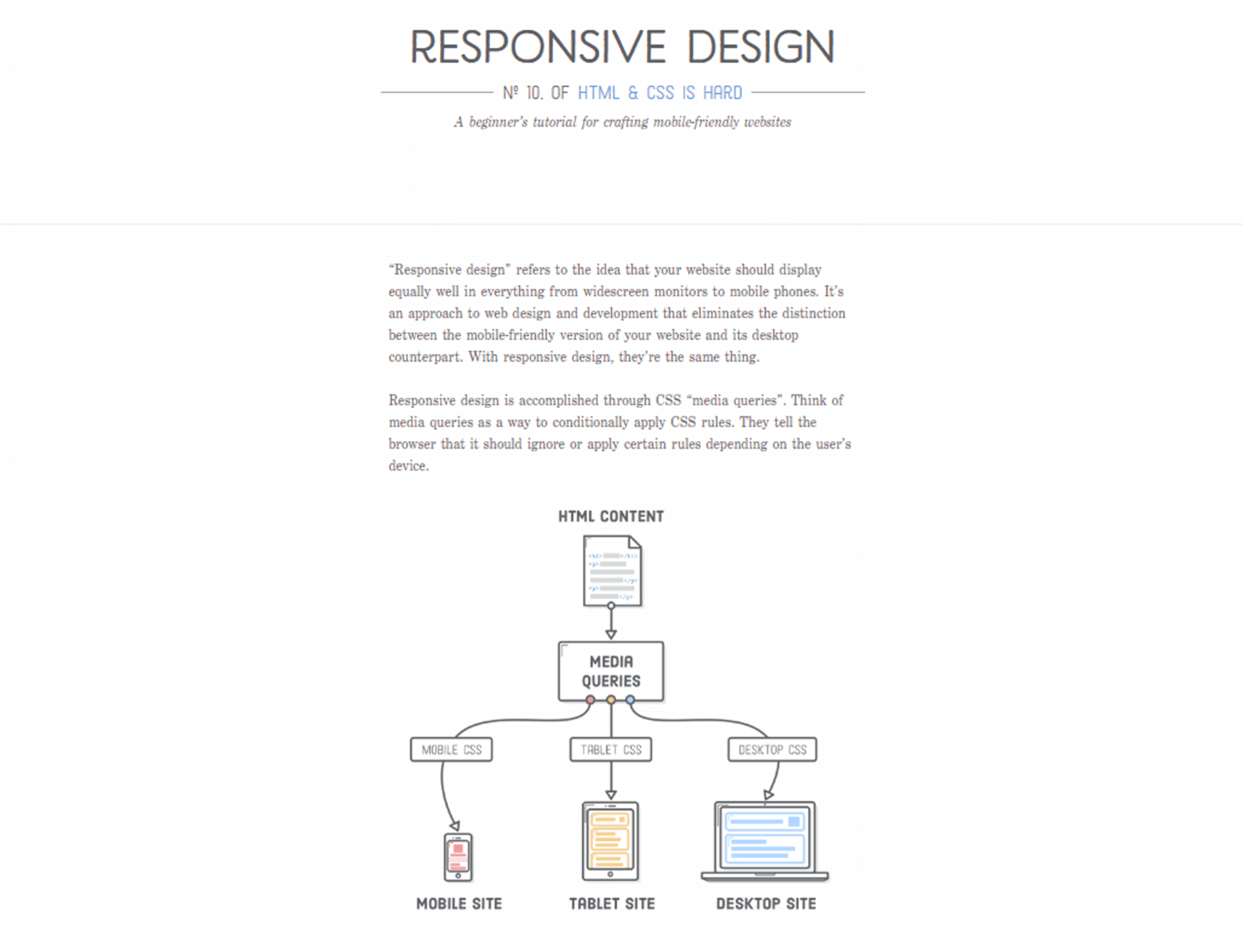
- A Beginner’s Tutorial For Crafting Mobile-Friendly Websites
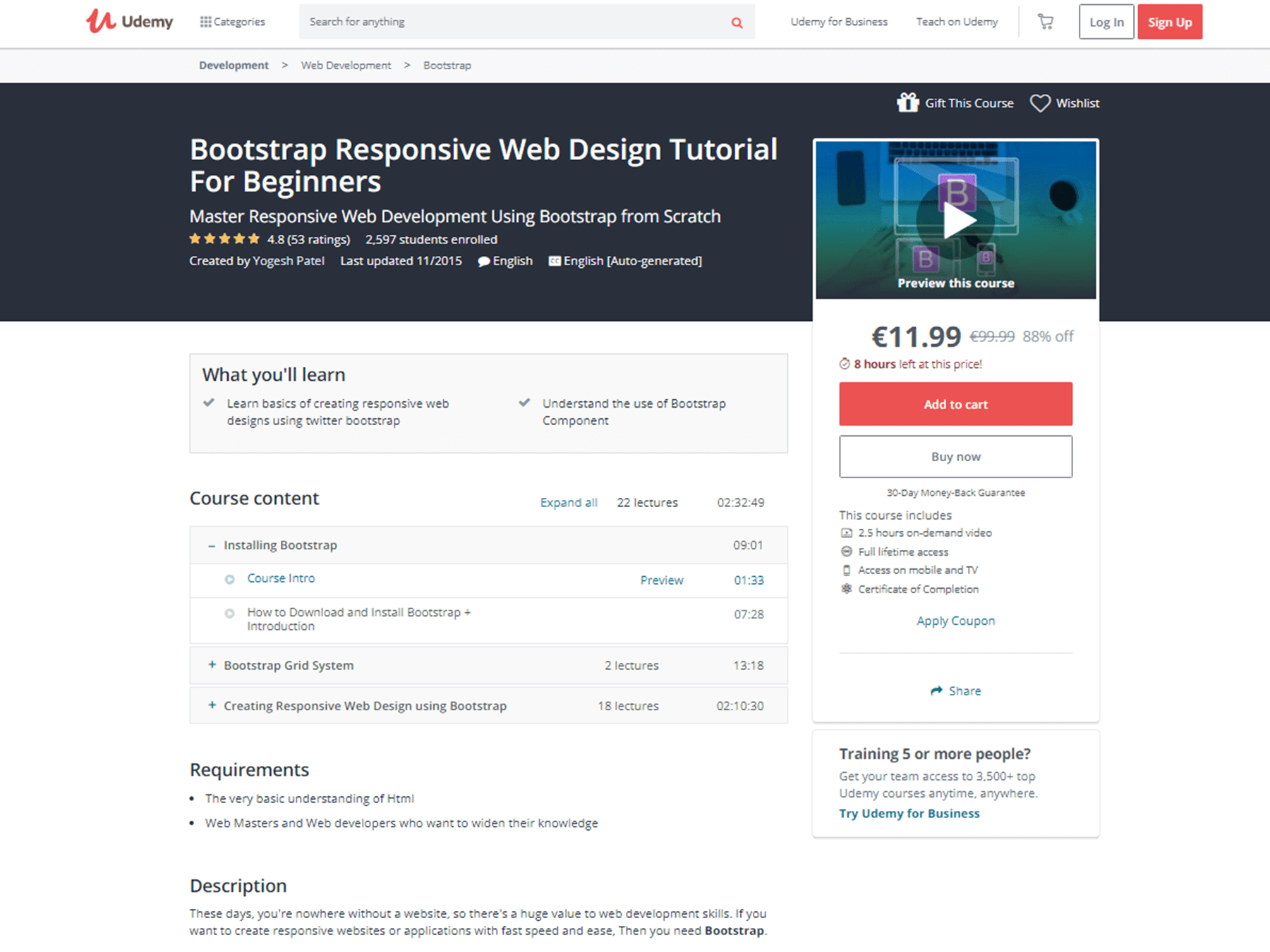
- Bootstrap Responsive Web Design Tutorial For Beginners
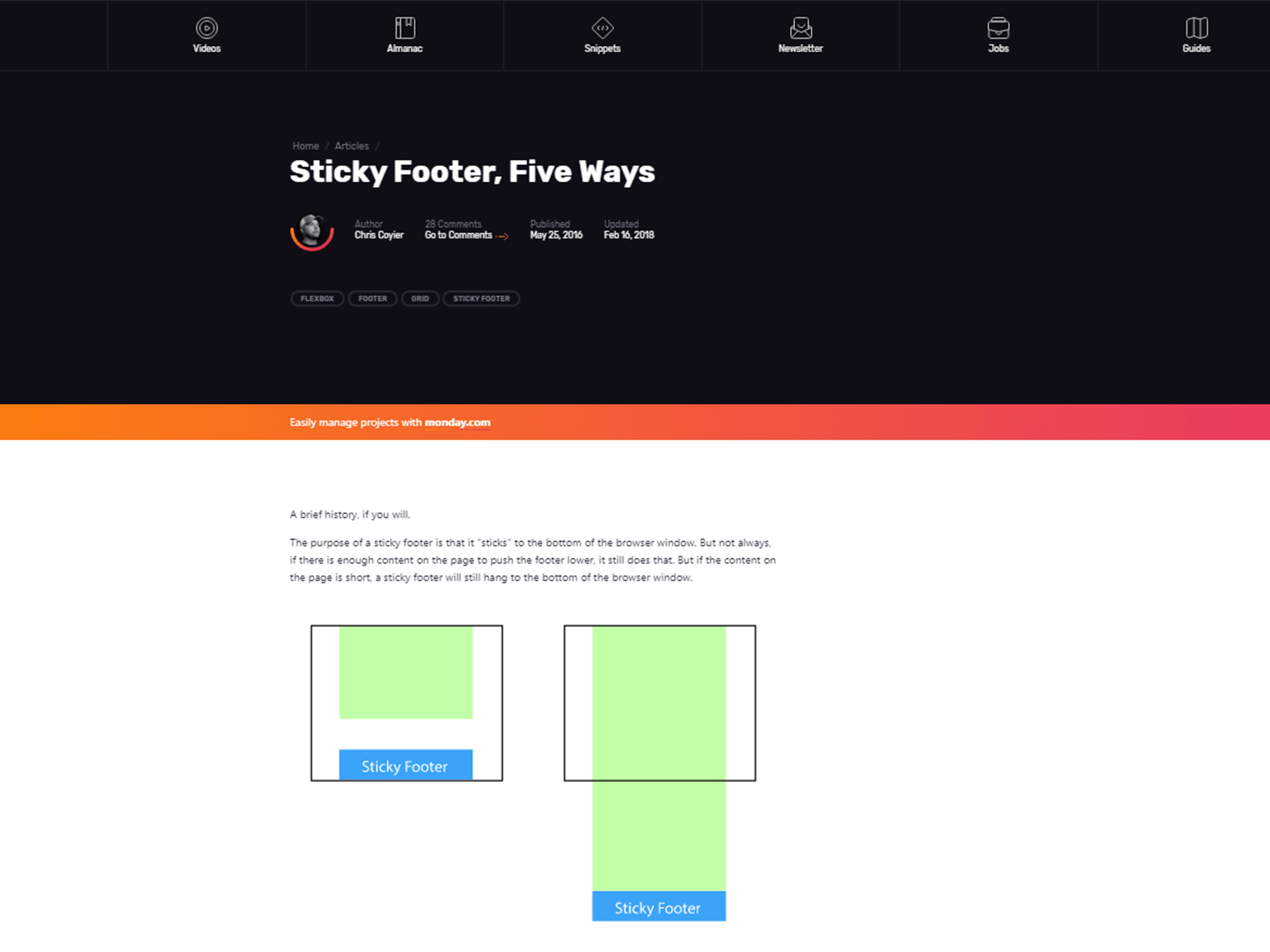
- Sticky Footer, Five Ways
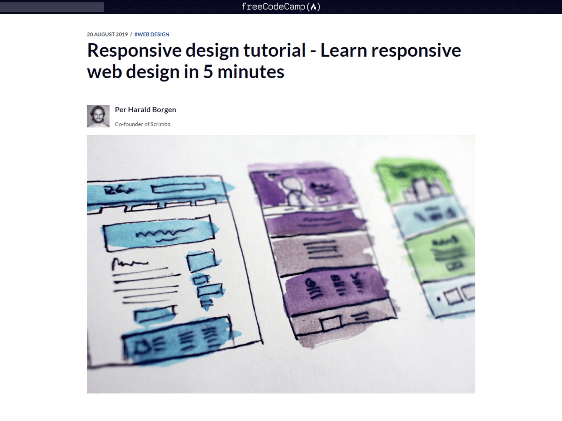
Responsive Design Tutorial – Learn Responsive Web Design In 5 Minutes
How to Think Responsively: A Responsive Web Design Tutorial
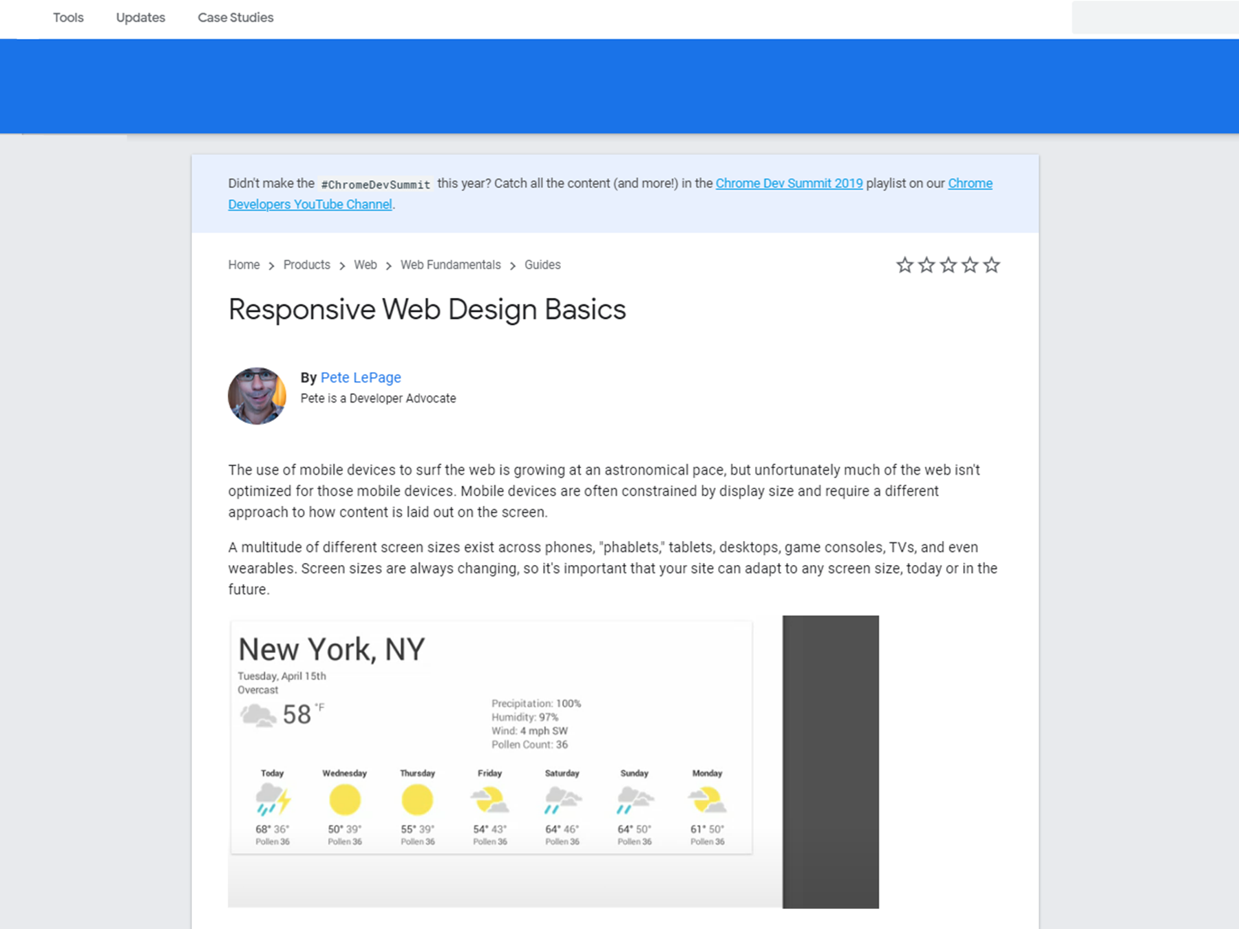
Responsive Web Design Basics
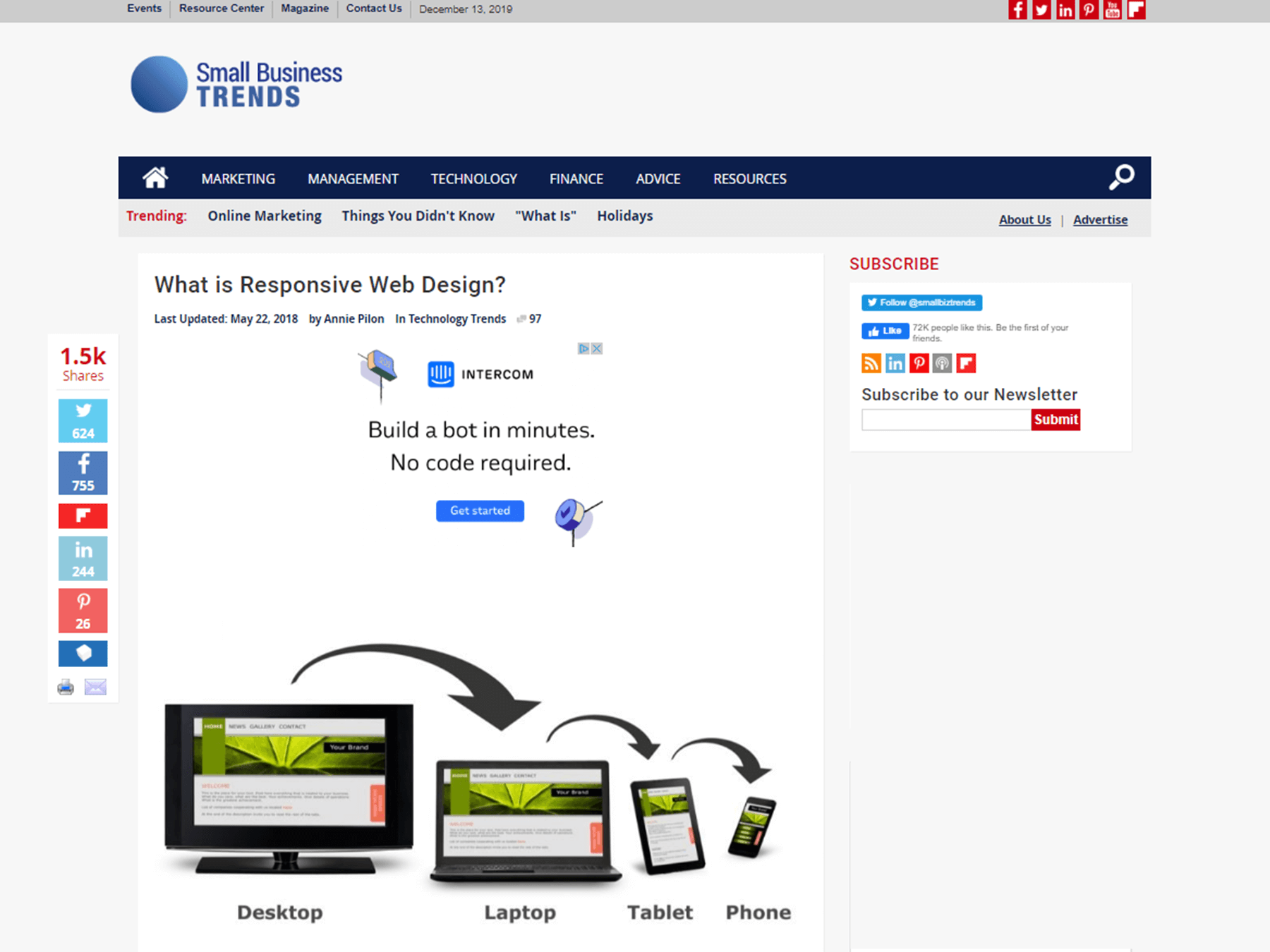
What is Responsive Web Design?
Master Responsive Website Design With This Free Four-Hour Course
How To Build A Responsive Blog Design With Bulma CSS
Responsive Web Design with HTML&CSS
Auto-Layout: Introducing Stacks — Flexbox for Sketch
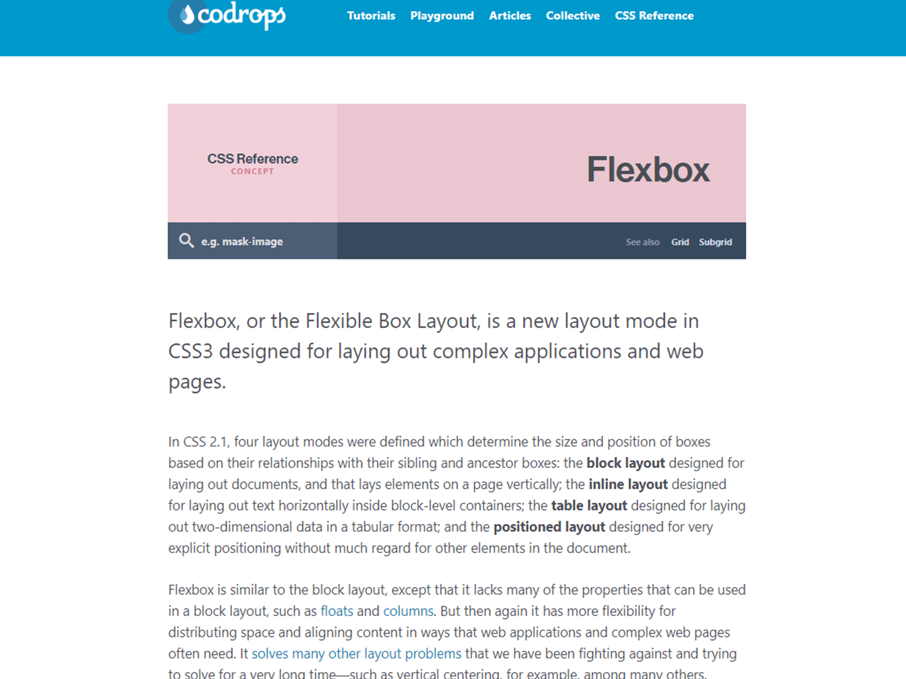
Codrops Flexbox Reference
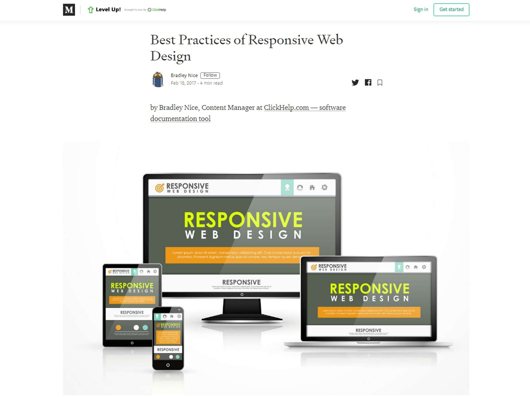
Best Practices of Responsive Web Design
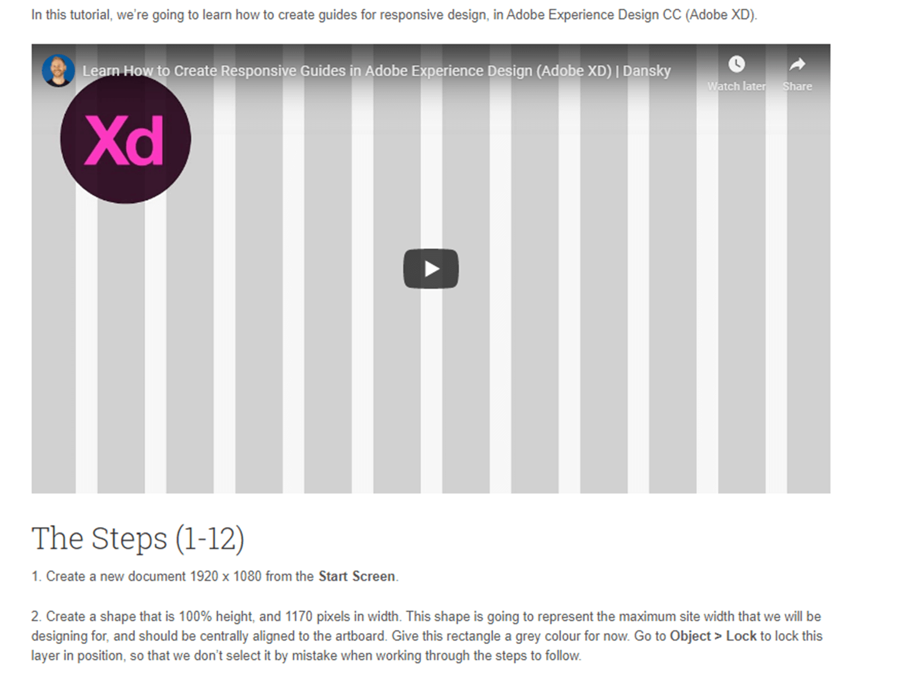
How to Create Responsive Guides in Adobe XD
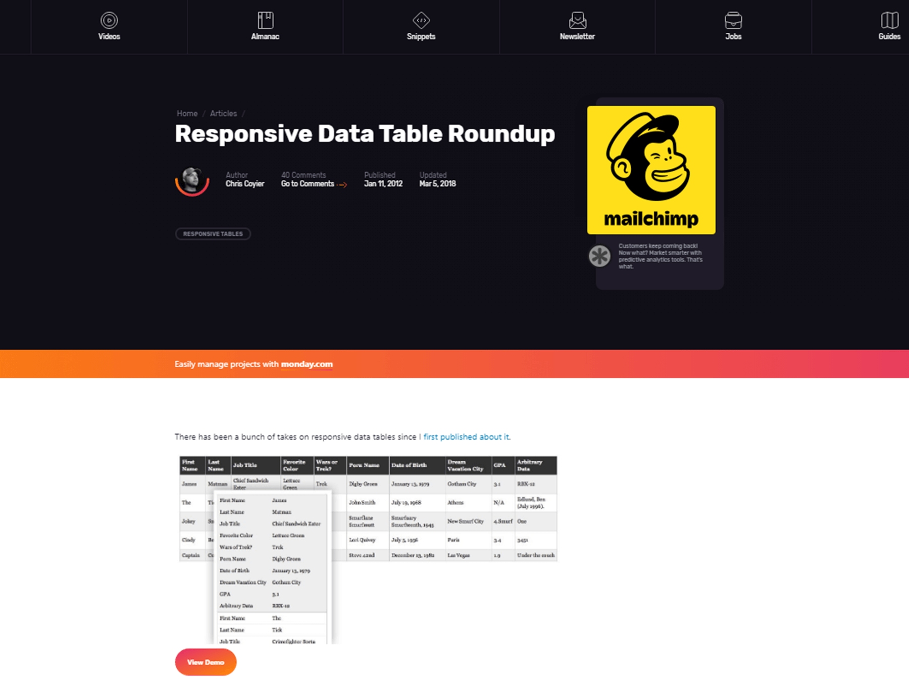
Responsive Data Table Roundup
A Beginner’s Tutorial For Crafting Mobile-Friendly Websites
Bootstrap Responsive Web Design Tutorial For Beginners
 Best SEO Companies