 Best SEO Companies
The era of the smartphone is in full swing, with about 50% of all traffic coming from mobile devices.
In fact, mobile ecommerce has gained such traction that it’s coined a new phrase: m-commerce.
So what does this mean for the world of web design?
It means that responsive web design isn’t just a must, it should be a given. Without a mobile-friendly website, you (and your clients, if you’re a designer yourself) are losing valuable traffic and sales.
Check out these up-to-date responsive web design stats to see how you can drive more traffic with mobile first design.
Table of Contents
- Responsive web design stats takeaways (a “TL;DR”)
- Brand new responsive web design stats
- #1 – Mobile pages take longer to load than desktop pages
- #2 – A third of mobile sites load above-the-fold content in less than five seconds
- #3 – Smartphones are responsible for most media consumption
- #4 – Gen Z mobile users engage 60% more than older generations
- #5 – Mobile visitors don’t convert as well as desktop visitors
- #6 – But, tablets convert higher than mobiles
- #7 – 40% of shoppers define their brand experience by the mobile buying ease
- #8 – 9 out of 10 people leave non-responsive websites
- #10 – Three quarters of people buy with mobiles
- Conclusion
Responsive web design stats takeaways (a “TL;DR”)
Since smart devices have become so key to daily lives, it’s vital that you’re able to reach your audience where they prefer to browse and that your website looks great when they arrive.
Now that half of your traffic is coming from mobile devices, your responsive design needs to be equal to or better than your desktop version.
To do this, you need to think about more than how the page shuffles to fit the screen size.
You need to consider:
- How cluttered mobile pages look
- How easy it is to click elements on a touchscreen
- How big text is for readability
- How quickly your mobile site is loading
Here’s a great example of how your mobile responsive site could look:

Look how Obeliu Vodka grabs your attention immediately.
With nothing but a high-definition image and a killer unique value proposition (UVP), you’re engaged.
The brand shows off its personality instantly, without overloading the page.
This means the mobile website loads quickly, and customers are drawn in from the get-go.
The image and text fit to screen, and the site scrolls seamlessly for a frictionless user experience.
Brand new responsive web design stats
#1 – Mobile pages take longer to load than desktop pages
While mobile use has become a dominant behavior in society, mobile page speed still lags behind.
Though mobile users contribute to nearly half of all traffic, mobile pages still take almost twice as long to load.
70% of desktop sites take around seven seconds to load.
On average, mobile pages take 15 seconds to load.
Work on boosting your mobile page speed to boost responsiveness.
Try using Google PageSpeed Insights to diagnose page loading issues.
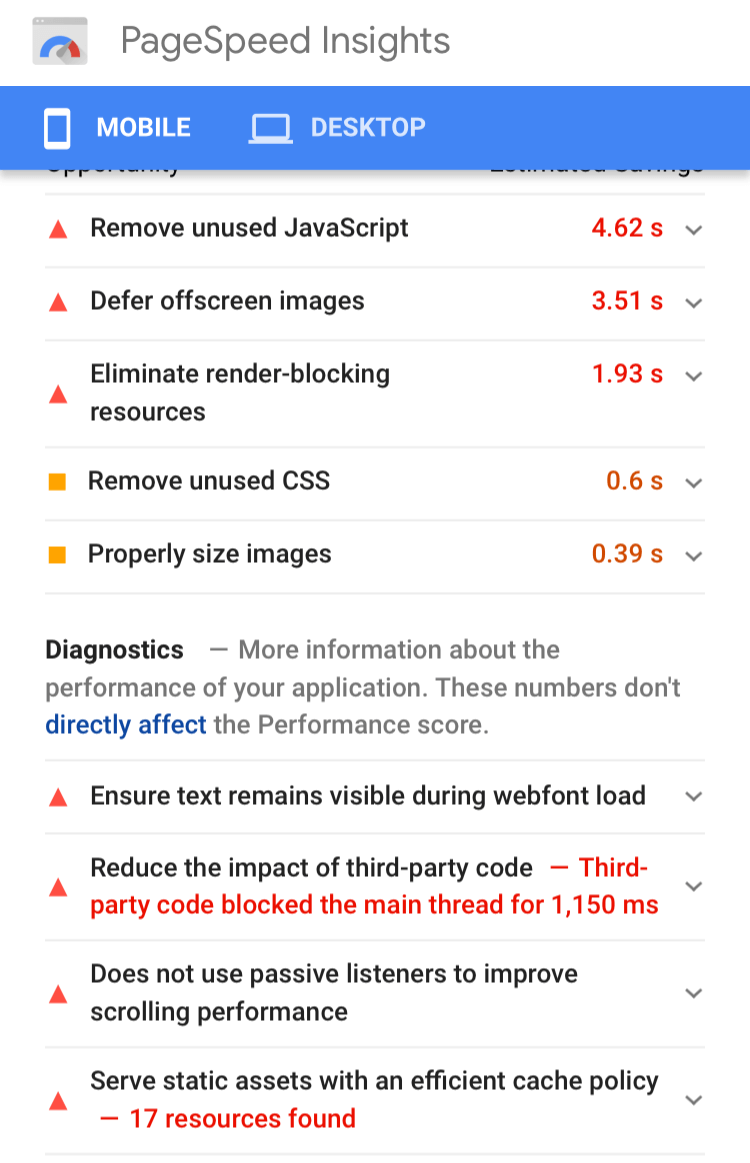
By running your website through this page speed audit tool, you’ll be able to identify the technical bottlenecks.
That way you’ll have an action plan to improve page loading speed to less than five seconds — Google’s recommended page speed.
That’s how BMW increased traffic to its mobile sales pages.

By making ‘speed’ their top three priorities when rebuilding their mobile site, BMW boosted organic traffic by 22%.
#2 – A third of mobile sites load above-the-fold content in less than five seconds
While it’s true that mobile pages are notoriously slow-loading, that doesn’t mean you can’t get creative with responsiveness.
It might take 15 seconds for mobile pages to fully load. But, 30% of the mobile landing pages load fully above the fold in less than five seconds.
That means that a mobile visitor can see visual content on the screen after five seconds, even if they can’t click or scroll.
This is prime marketing real estate.
Between the five seconds it takes for your visual content to load and the 15 seconds it takes for your site to fully load, you have 10 seconds to capture your audience.
Put a promotion front and center or introduce your brand’s personality with a bold UVP.

See how this natural clothing brand gets straight to the heart of the company’s ethics.
Targeting its UVP to eco-conscious consumers, the brand immediately mirrors this concern for sustainability. This captures their target audience with above-the-fold fast-loading content.
Also, by reducing the image size to half the page, replacing the other half with text, the page loads quickly.
#3 – Smartphones are responsible for most media consumption
Traditional forms of media, such as TV, newspaper, and radio, still live on. But, smartphones lead the way in how people consume media.
Every day, people spend 3 hours and 49 mins on their smartphone. That’s 16% of your entire day dedicated to viewing content on your smartphone.
In comparison, the average person spends 3 hours 10 minutes watching TV each day.
Now consider that the average 30-second nation-wide TV advert costs $105,000. While TV ads are known to have pretty good ROI, this outlay is unrealistic for most small businesses.
Let’s compare this to mobile responsive ads.
If you’d like to support your mobile friendly website with responsive ads, the ROI of a mobile responsive ad campaign is 200%.
That’s a fairly good return from an advertising campaign.
The difference is, you can start a mobile responsive ad campaign with as little as $10.
In this respect, focusing your efforts on mobile responsive design over traditional media platforms is a more affordable way to drive conversions.
#4 – Gen Z mobile users engage 60% more than older generations
Unsurprisingly, younger mobile users engage with brands more than older generations.
Older generations are engaging 60% less than younger generations.
This means that when you implement responsive design, you need to be tailoring your website to younger audiences. You’ll find more engagement in these age groups.
If your products and services are targeted toward older age groups, consider how to increase engagement with responsive design.
Firstly, choose design features that help older age groups use your website. For example, buttons and text should be larger, for easier readability and clickability.
Secondly, ensure that your responsive design is intuitive.
This means that the customer journey should be obvious to a non-tech-minded user.
Make sure less experienced technological generations understand clearly where to click next to move toward conversion.
Stairlift brand, Stannah, does this extremely well.

Getting creative with responsive design, Stannah chooses to dedicate a large section of prime landing page space to a phone number.
Since older generations are more familiar with telephone sales, this is a wise move to increase conversions.
More importantly, it’s a simple responsive design tactic that doesn’t require heavy web design elements or interactive features.
The result? A faster, more responsive website, with higher targeted conversions.
You’ll also notice the oversized ‘LIVE CHAT’ button and the large text.
#5 – Mobile visitors don’t convert as well as desktop visitors
When it comes to ecommerce, you’ll get more conversions on your desktop website than your mobile site.
This is surprising as mobile traffic accounts for 65% of all ecommerce traffic.
Despite this, mobiles only make up 53% of sales.
On the other hand, desktop websites contribute to 35% of traffic, yet account for 47% of sales.
While this could indicate that desktop websites are more profitable, it speaks more to the lack of responsiveness on most ecommerce websites.
To increase conversions on your m-commerce site, you’ll need to improve the responsive performance.
One great way to do this is to personalize the mobile experience to encourage conversions with interactive features.
#6 – But, tablets convert higher than mobiles
When you consider a responsive redesign of your website, it’s vital to think beyond the smartphone.
It’s extremely important that your website is responsive to smartphones since 90% of people own a smartphone.
However, conversions from phones are lower than the conversion rate you’ll experience from tablets.
While mobile responsiveness is important, mobile sites convert 47% less than desktops websites.
However, tablets have 53% higher conversion rates than phones.
In this respect, you need to ensure your site is responsive for every type of mobile device, not just phones.
#7 – 40% of shoppers define their brand experience by the mobile buying ease
User experience has become one of the top indicators of success for brands.
Previously, it was enough to have a professional-looking display of products and services.
Nowadays, however, consumers demand personalized, interactive experiences that streamline the buying process.
In today’s world, 40% of shoppers judge how positive an experience is on how easy the mobile buying process was.
This means that, while your products might be top-notch and your prices might be dead on, if your buyer struggles to make a purchase, you’ll lose future customers.
Buyers want frictionless mobile payments. To achieve this, consider responsive mobile payment options.
There’s nothing worse than trying to type credit card details into a tiny desktop-worthy box.
Make sure payment systems are designed for touchscreen and optimized for mobile performance.
Typically, companies use Stripe or Paypal for seamless mobile payments.
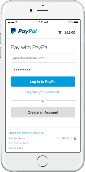
Buyers simply log in to the payment gateway or purchase items as a guest.
The payment gateway handles all transactions and charges you a small fee for this service.
For the end user, mobile payments are completed in seconds. For you, mobile users convert more easily, reducing abandonment rates.

Styling subscription box, Frockbox, has designed a highly interactive personalized responsive mobile website.
By offering a style quiz, the fashion brand removes all heavy images and slow-loading videos from its mobile site.
The mobile site is quick to load and responsive to mobile screens, as it isn’t weighed down by clutter.
Equally, the user experience feels extremely personal. It’s also highly engaging.
These factors increase the chances that a visitor will convert to a buyer.
#8 – 9 out of 10 people leave non-responsive websites
Mobile buyers are tough customers. While they only convert half the time, they have a mega high bounce rate.
When mobile users access websites, 93% of people will leave a site if it doesn’t have responsive design.
Let’s consider this abandonment rate next to your mobile conversion rate.
As noted previously, 65% of ecommerce traffic comes from mobiles. Only 53% of this traffic converts.
So if you have 100 customers, 65 of those come through mobile devices.
Now, if your site is non-responsive, 93% of your 65 customers will leave. That’s 60 out of 65 potential customers.
This leaves you five remaining customers. Of those, only two or three will convert.
#10 – Three quarters of people buy with mobiles
It’s clear that the bottleneck between mobile buyers and mobile conversions is responsive website design.
77% of people use one or more mobile payment platforms, yet mobiles still account for fewer conversions.
The solution to this lies in targeted mobile friendly web design.
Consider that 91% of millennials purchase using mobiles, compared to just 64% of boomers.
You could improve responsive design to assist more boomers in purchasing. Alternatively, you could double down on millennials.
Test to find which responsive web design element millennials respond to and work to integrate these perfectly.
If you’re sitting on the fence about responsive website design, it’s worth thinking about how the ecommerce sector is responding to mobile friendly payments.
A third of organizations say that implementing mobile payments is a top priority. Despite this, only 17% of ecommerce sites have achieved this so far.
It’s clear, then, that to stay ahead of the curve, you need to act quickly. Implement responsive payment processes, to assist the flow of m-commerce through your mobile site.
Conclusion
No doubt, you’re starting to see the bigger picture. These brand new web design stats say it all: mobile friendly sites are a must.
Ecommerce is transitioning to mobile devices at a runaway pace. If you’re not optimizing your website for mobile users, you’ll lose potential traffic before you’ve even started.
If you need more help getting to grips with these responsive web design stats, contact the web experts at Design Woop.
 Best SEO Companies