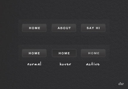
In this tutorial I will show you how to create a clean and stylish menu using pure CSS3, no images or javascript here I’m afraid. The CSS3 menu will work in Firefox, Chrome, Opera and Safari. Notice what browser is missing…yup Internet Explorer, IE will not support this.
Table of Contents
The Final Design

The Demo
See the CSS3 menu demo in action.
About This Menu
- Created using pure CSS
- No images
- No Javascript
- Three states, normal, hover, and active.
- Gradients and rounded corners easily changed.
- CSS3 fallback: if you are running a browser that does not support CSS3, the menu will display normally without the gradients, rounded corners and text shaddows.
The HTML
[php]
<div id=”box”>
<ul id=”menu”>
<li><a href=”#”>Home</a></li>
<li><a href=”#”>About</a></li>
<li><a href=”#”>Say Hi</a></li>
</ul>
</div>
[/php]
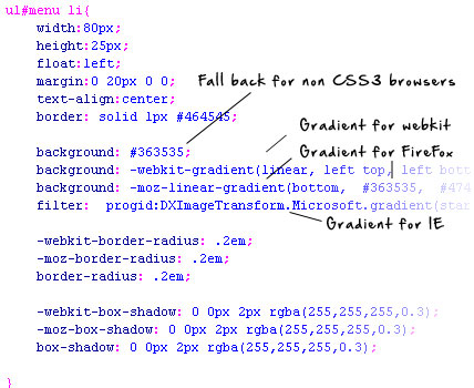
CSS3 Gradient
CSS gradients are a nice little feature to CSS3, however a set standard has not been chosen, because of this you will need to use vendor specific code to get the effect in most browsers.
Take a look at the code:
[php]
background: -webkit-gradient(linear, left top, left bottom, from(#363535), to(#474646));
background: -moz-linear-gradient(bottom, #363535, #474646);
filter: progid:DXImageTransform.Microsoft.gradient(startColorstr=’#363535′, endColorstr=’#474646′);
[/php]

CSS3 Rounded Corners
CSS3 border-radius allows you to create rounded corners easily without images or Javascript. Again you need to specify browser specific code as there is not currently a set standard.
Take a look at the code:
[php]
-webkit-border-radius: .2em;
-moz-border-radius: .2em;
border-radius: .2em;
[/php]

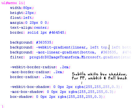
CSS3 Box Shaddow
A favorite CSS3 effect of mine is the drop shadow, this easily lets you add inner and outer drop shaddows with minimal code. You can specify the shadow color, size, blur and offset.
Take a look at the code:
[php]
-webkit-box-shadow: 0 0px 2px rgba(255,255,255,0.3);
-moz-box-shadow: 0 0px 2px rgba(255,255,255,0.3);
box-shadow: 0 0px 2px rgba(255,255,255,0.3);
[/php]

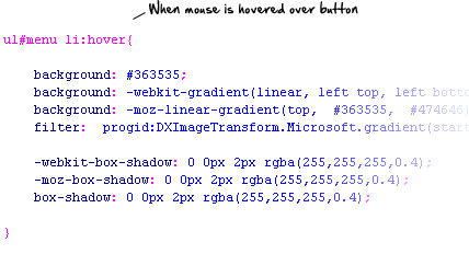
Hover State
When a user hovers over one of the buttons I can change the style of the button using :hover. To change the style of a button item when a user is hovering their mouse I simply change the above CSS color/shaddow properties withing ul#menu li:hover{} to my desired style.

Active State (Clicked)
Changing the state of a button when a user actually clicks it is a cool way to add some interaction to the menu, you can apply different CSS styles to menu items by using :active. To alter how the button looks when clicked change the CSS in ul#menu li a:active{}.

 Best SEO Companies
 Best SEO Companies