Having a good selection of tools to aid your design process can greatly improve your productivity, there are a few design tools I use on a regular basis and believe any time saved, even if small is great.
In this post I am going to be focusing on CSS grid generators and pre-built css grid templates. I always use grids when designing websites and pretty much any other graphical element for a site, I think grid tools are my most well used items when designing.
The grid resource I use pretty much all the time is the 960 Grid System, it works well and is well documented, so this is my first grid recommendation.
Table of Contents
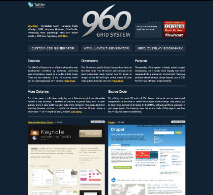
960 Grid System
The 960 Grid System is an effort to streamline web development workflow by providing commonly used dimensions, based on a width of 960 pixels. There are two variants: 12 and 16 columns, which can be used separately or in tandem.
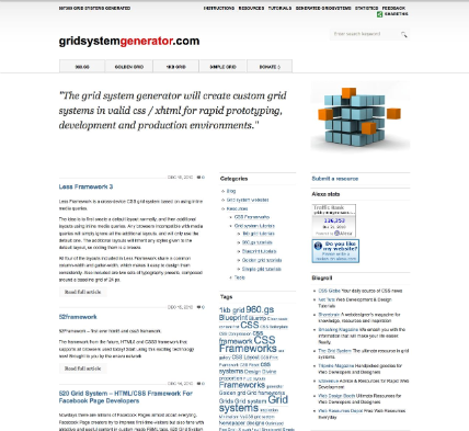
Grid System Generator
The grid system generator creates custom grid systems in valid css / xhtml for rapid prototyping, development and production environments.
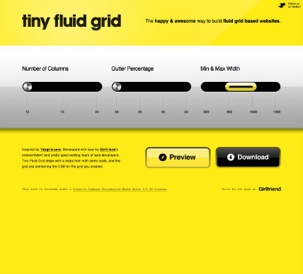
Tiny Fluid Grid
A slick looking UI and a tool that deserves a place in your bookmarks. Tiny Fluid Grid ships with a index.html with demo code, and the grid.css containing the CSS for the grid you created.
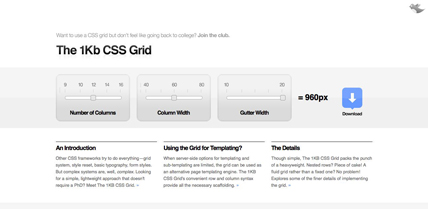
1kb CSS Grid
Other CSS frameworks try to do everything—grid system, style reset, basic typography, form styles. But complex systems are, well, complex. Looking for a simple, lightweight approach that doesn’t require a PhD? Meet The 1KB CSS Grid.
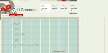
NP Grid Generator
Grid Generator allows you to design your own grid by specifying the usual parameters like column width and gutter width.
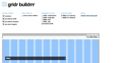
Gridr Buildrrr
Allows you to build your own grid by specifying column widths, margins and column numbers.
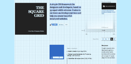
The Square Grid
A simple CSS framework for designers and developers, based on 35 equal-width columns. It aims to cut down on development time and help you create beautiful-structured websites.
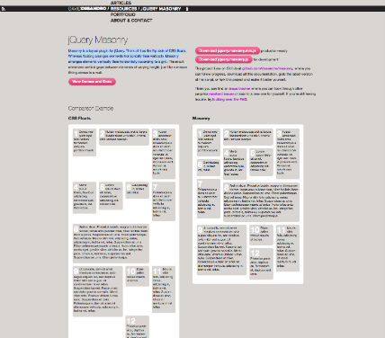
jQuery Masonry
Masonry is a layout plugin for jQuery. Think of it as the flip side of CSS floats. Whereas floating arranges elements horizontally then vertically, Masonry arranges elements vertically then horizontally according to a grid.
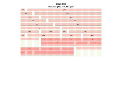
The Simpler 940px Grid
Don’t force your design to fit to a grid that hinders your creative genius. Do what makes your designs look good and is comfortable to you. A grid should be your layout guideline, not restriction.
Note:
I shall be following up the post, by using one of the grids to design and code a simple one page portfolio design. Grab the RSS and stay tuned.
 Best SEO Companies
 Best SEO Companies