What good is any eCommerce website without the expected payment & checkout page? This step often gets the most focus from customers. And these customers want to ensure their information is correct. The input fields should be easy to use. Nothing should be too cluttered or congested. Reducing confusion during checkout will help to expedite the process. Therefore, you will get more satisfied customers. And those customers will feel safe with their transactions.
Take a peek at the examples of checkout pages from this gallery to find other ideas related to checkout forms. These designs might even give you the urge to redesign your own checkout process! Not to mention you can learn a lot about online payment systems by putting yourself in the shoes of a customer. If you are very new to web design and just started planning or creating your own website, you might find our article about Starting an Online Store. A Step by Step Guide quite useful and time worthy.
Table of Contents
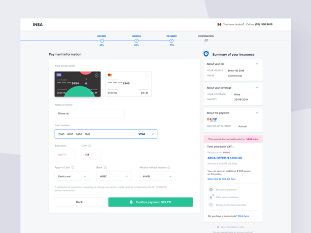
- Car Insurance Checkout Page
- Login & Checkout
- Minimal Checkout
- Responsive Checkout
- Simple Checkout
- iPad Checkout
- Yummy Land Mobile App
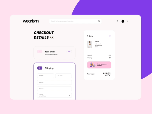
- Wearism
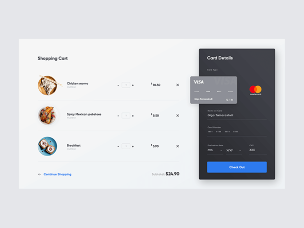
- Shopping Cart UI
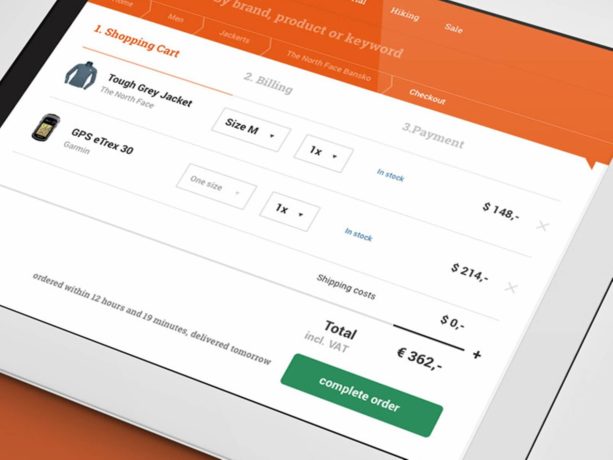
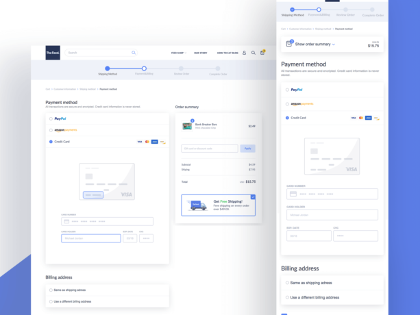
- Shopify Checkout Responsive Payment
- Car Insurance Checkout Page
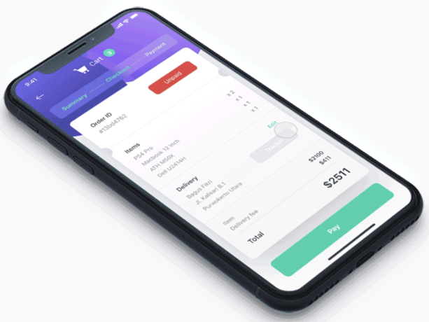
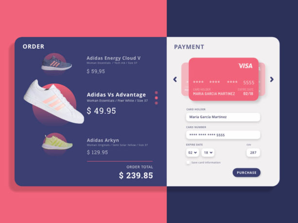
- Payment Flow
- Ananda
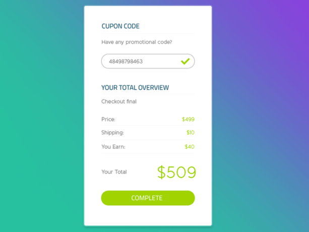
- Checkout
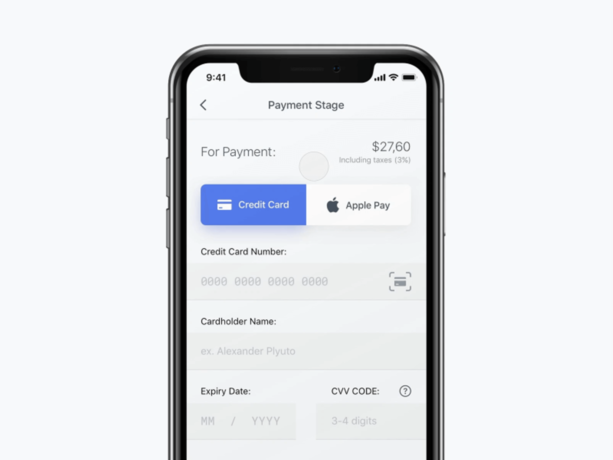
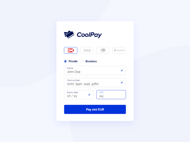
- Credit Card Checkout
- Checkout
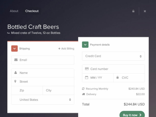
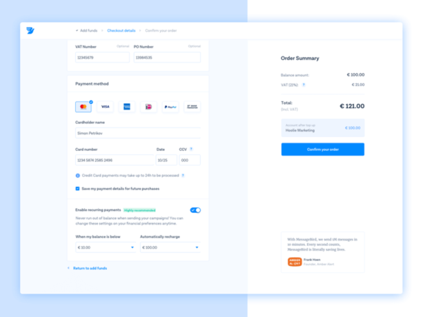
- Recurring Payments
- Checkout Flow
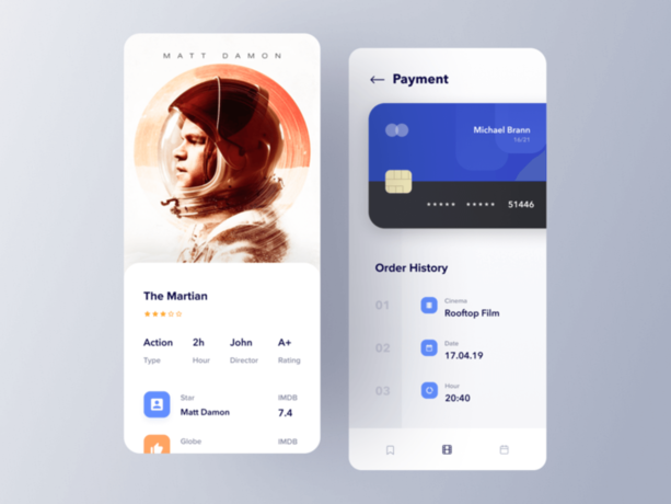
- Movie Ticket App Payment
- Checkout Using Credit Cards for Shopping
- Checkout
- Payment Gateway
- Dashboard
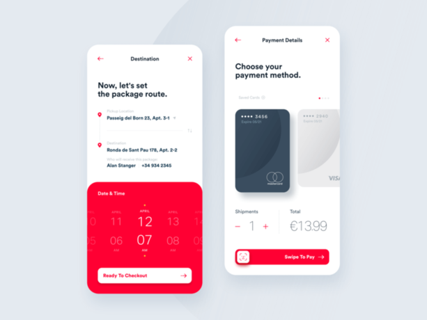
- Set Destination & Checkout
- Checkout
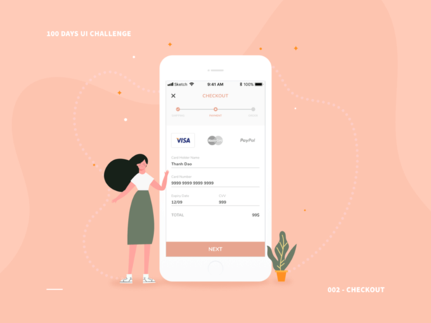
- Checkout Page
- Checkout
- Card Checkout
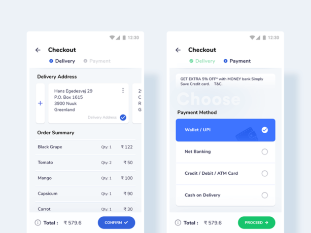
- Checkout – Grocery App
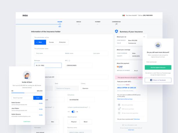
Car Insurance Checkout Page
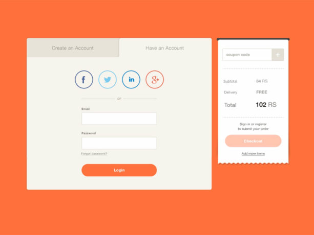
Login & Checkout
Minimal Checkout
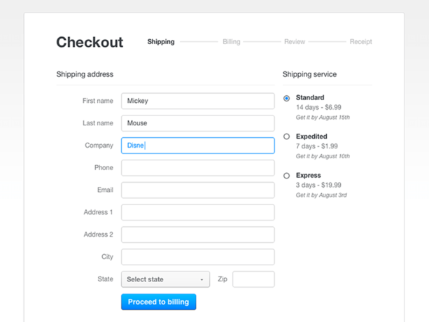
Responsive Checkout
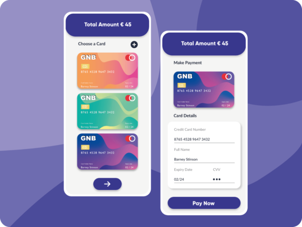
Simple Checkout
iPad Checkout
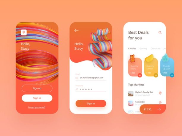
Yummy Land Mobile App
Wearism
Shopping Cart UI
Shopify Checkout Responsive Payment
Car Insurance Checkout Page
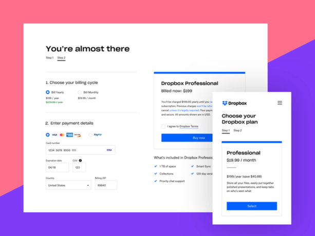
Payment Flow
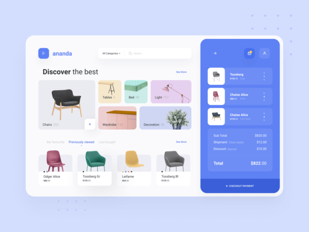
Ananda
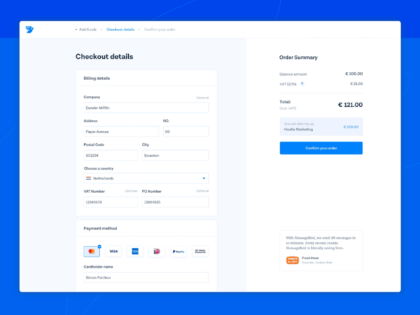
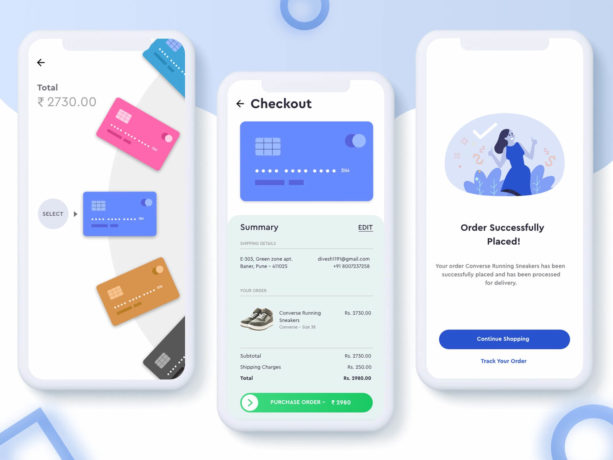
Checkout
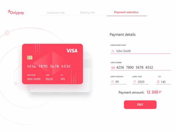
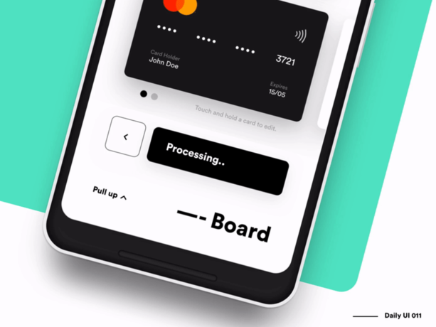
Credit Card Checkout
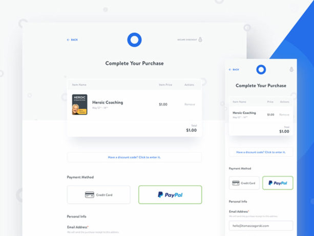
Checkout
Recurring Payments
Checkout Flow
Movie Ticket App Payment
Checkout Using Credit Cards for Shopping
Checkout
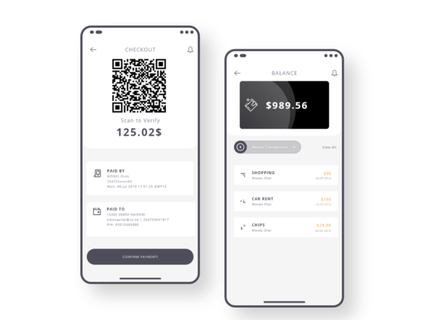
Payment Gateway
Dashboard
Set Destination & Checkout
Checkout
Checkout Page
Checkout
Card Checkout
Checkout – Grocery App