There’s a huge variety of logo styles out there, but few logo trends are cooler than the retro look. Vintage logos – the kind that you could easily imagine seeing in a 50’s diner – are actually surprisingly difficult to design. They need to look cool, slick and stylish – without looking tacky or cheesy. In other words, to be truly cool, they need to be more Mad Men than Happy Days.
We’ve brought together a collection of beautifully crafted, retro logos that will hopefully inspire you for your next design.
Source: https://dribbble.com/shots/25861-Gilford-Sons-Logo-Final
Gilford & Sons have a beautifully designed logo that remains simple yet functional & classy. The two tone effect shading and the stern, professional typeface create a sharp, retro logo that’s full of character.
Source: https://dribbble.com/shots/462253-Ms-Tidy-Logo
The logo for Ms Tidy Residential Cleaning uses hand-drawn typography and a character to add personality to the design.

Source: https://dribbble.com/shots/132881-Smart-Goal
The logo for Smart Goal uses clean, angular lines to create a vintage effect. The design also uses plenty of texture to help give it a slightly faded, retro look.
Source: https://dribbble.com/shots/466724-ARRC-Logo
The American Road Racing Club logo is beautifully designed, and looks like it’s straight out of a 1950’s American car club. The circular badge style and the faded texture of the logo both hint at a retro-style, and are used to great effect here.
Source: https://dribbble.com/shots/395127-Lunchpad
Lunchpad makes heavy use of a retro-inspired typeface to create a 1950’s vintage look, and despite the playful font, the black and white style helps to keep the design looking sophisticated.
Studio 85 have created an ultra-clean mark that looks professional & classy, while the circular design gives the logo a badge-like quality.
Source: https://dribbble.com/shots/312181-STUDIO85-3
Source: https://dribbble.com/shots/336286-Mr-Dj
Mr DJ event services have a complicated logo, but it’s full of personality – and the quirky, retro style helps to make the logo memorable and fun.
Source: https://dribbble.com/shots/278266-Vintage-Hydroplane-Federation
The logo for the Hydroplane federation is reminiscent of the 1950’s vision of the future and looks like something out of the Jetsons. The bright red and the muted green in the design help to add to the retro feel of the logo, while the typography has a very vintage feel to it.
Source: https://dribbble.com/shots/333411-Tokyo-Bicycles-Logo
The logo for Tokyo Bicycles has a retro cartoon feel to it, with big bold borders and muted colours complementing the hand-drawn typeface perfectly.
Source: https://dribbble.com/shots/359504-Six-Yard-4
Six Yard have used angular lines in their logo to form a badge, while a ribbon is used in the background to add a touch of elegance. There’s something very retro about the solid, bold typeface and the texture of the shading on the ribbon that makes the design look strong.
Source: https://dribbble.com/shots/287891-Bubbles
Tonic’s logo is based on a custom-designed typeface that could easily be at home on a 1950’s fizzy drink bottle. The playful font suggests that Tonic is a fun, interesting & quirky brand, while the shading and highlights in the type help to make the logo “pop” slightly, and keep that retro feel.
Source: https://dribbble.com/shots/64770-Neo-Retro-Aviation-Logo-Red-
Avionics Masters have an astonishingly retro style logo, from the vintage effect font to the silhouette of the plane, it’s hard to find a more vintage design.
Source: https://dribbble.com/shots/368811-The-Collective-Logo
The Collective coworking space in Italy have opted to used two very vintage typefaces in their logo – the first is bold and strong, while the second has a more retro hand-written quality to it. Both complement the other in a surprisingly effective way, while the colours in the design also have a very retro feel to them.
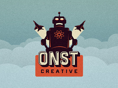
Source: https://dribbble.com/shots/482059-ONST-Creative-Logo-Final-
ONST Creative have an amazingly designed, extremely fun & quirky logo. The typeface is very heavily inspired by retro designs, while the robot that’s featured is straight out of the 50’s.
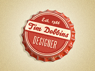
Source: https://dribbble.com/shots/104327-Bottle-Cap-Logo
Tim Dobbins has used a number of techniques to give his logo a retro feel. The choice of red and faded white work really well together, while the angled lines surrounding the word “Designer” help to add texture. The hand-drawn font also completes the logo and really adds a vintage quality to it.
Are there any retro logo designs that you’ve found that deserve a mention? Let us know in the comments.
Dan writes for gift ideas experts The Handpicked Collection, who specialise in wedding gifts and presents. In his spare time he studies graphic design and practices his skills in Illustrator.
 Best SEO Companies
 Best SEO Companies