Multi-million dollar corporations only seem to be growing their fortunes. So, it’s bizarre that some of the world’s most familiar brands have been so successful with such bad logos.
Why not put some of those profits into a logo re-brand?
Pressure to match up to slick tech firms and fresh, young start-ups has sent some legacy brands racing to update stuffy typography and simplify complex emblems.
But, the 18 big brands in this handy bad logo guide have stuck it out with the worst logos that the marketing industry has ever seen.
Perhaps you’re wondering what makes a bad logo and how to design a strong brand motif that stands the test of time.
Luckily, this comprehensive guide to bad logo design gives you a myriad of terrible logo examples, along with expert advice on how to design a future-proof logo for 2020.
Table of Contents
- What Makes a Bad Logo?
- What Makes a Bad Logo: Unclear font and overly complex design
- What Makes a Bad Logo: Imitating another brand logo
- What Makes a Bad Logo: Using a familiar font
- What Makes a Bad Logo: Unremarkable and uninspiring
- What Makes a Bad Logo: Incongruent and irrelevant graphics
- What Makes a Bad Logo: Outdated style
- How to Design a Strong Brand Logo
- 18 Bad Logo Examples
- Bad Logo Example #1: Shell
- Bad Logo Example #2: IBM
- Bad Logo Example #3: Realtek
- Bad Logo Example #4: Arby’s
- Bad Logo Example #5: Motorola
- Bad Logo Example #6: Verizon
- Bad Logo Example #7: Sony
- Bad Logo Example #8: Mitsubishi
- Bad Logo Example #9: Pepsi
- Bad Logo Example #10: Starbucks
- Bad Logo Example #11: Warner Bros
- Bad Logo Example #12: Asics
- Bad Logo Example #13: Chanel vs Gucci
- Bad Logo Example #14: Tokyo 2021 Olympics
- Bad Logo Example #15: Champion
- Bad Logo Example #16: Byblos
- Bad Logo Example #17: UGG
- Bad Logo Example #18: Tide vs Ecos
- Conclusion
What Makes a Bad Logo?
Here are the most common 2020 logo design mistakes:
What Makes a Bad Logo: Unclear font and overly complex design
If your logo design is unreadable or the graphic design is overly complex, potential customers will read it slower and have trouble committing it to memory.

Your font choice should be easy to read, so that customers will make the connection if they hear your brand on TV, a podcast, the radio, or from a friend recommendation.
What Makes a Bad Logo: Imitating another brand logo
If your brand logo looks like another company’s brand identity, customers will get confused, harming brand awareness. You could also end up accidentally boosting the credibility of another company.
This is particularly poignant if the company is:
- In your industry sector
- A direct competitor
- A well-known brand
What Makes a Bad Logo: Using a familiar font
You shouldn’t use any font that’s recognizable for another use.

This, of course, includes brand fonts. For example, you often see eateries using the Disney font. This is a no-no.
This also includes any font or graphic element that’s used for well-known services, such as newspaper headers.
What Makes a Bad Logo: Unremarkable and uninspiring
Looking back to Seth Godin’s world-renowned marketing bible Purple Cow, we’re reminded that products need to be remarkable to stand out.
Bad logos don’t stand out because they fail to create an emotional connection with customers. Customers need to be inspired to commit to your brand.
What Makes a Bad Logo: Incongruent and irrelevant graphics
Your visual identity should be a quick snapshot into what you do.

Bad logos have misrepresentative design concepts, confusing the consumer. What does a Vaillant, a boiler manufacturer, have to do with rabbits?
Make sure every graphic element relates to your corporate identity.
What Makes a Bad Logo: Outdated style
While retro concepts and vintage design certainly work their way through logo trend cycles, it’s important to acknowledge when your existing logo needs an update.
Otherwise your old logo sends the signal that your methods and practices are out of touch.
How to Design a Strong Brand Logo
A good logo designer knows that your logo forms your visual identity as a brand.
In this respect, you need to consider who sees it, what it says about your brand identity, and where it’ll be used.
Whether you’re rebranding or creating a brand new startup logo design from scratch, make sure your company’s logo is clear and simple, yet recognizable and memorable.
![]()
The Microsoft logo redesign is simple yet effective. The new logo cleverly incorporates the idea of ‘windows’ into its redesign with the four colored squares.
This logo redesign is also extremely versatile allowing for consistent branding across all marketing and social media platforms. Since consistent representation of brand identity can increase revenue by 23%, it’s important for your logo designer to consider this.
![]()
The Amazon logo is another great example as it includes two smart graphic design elements. The yellow arrow points from A-Z, showing that customers can use Amazon for everything.
Secondly, the yellow arrow and indented ‘z’ look like a smile, inciting an emotional response, boosting brand awareness.
18 Bad Logo Examples
One of the best ways to steer clear of bad logo design is to identify the red flags using bad logo examples.
Here are 18 examples of terrible logos that still exist in 2020.
Bad Logo Example #1: Shell

The Shell logo isn’t only uninspiring, the color choice is reminiscent of McDonald’s. Since a signature color choice can increase brand awareness by 80%, this is a huge graphic design faux paux by the logo designer.
Secondly, using a shell for the company’s logo is an odd attempt to signal that Shell cares about the environment.
While this may have boosted Shell’s corporate identity before society understood the perils of carbon energy, today this terrible logo image is a bit ironic for an oil and gas company.
Bad Logo Example #2: IBM

The IBM logo isn’t only hard to read, it gets more difficult to distinguish the larger the logo font is displayed.
The excessive use of negative space is confusing to the eye.
Designed by famous graphic designer, Paul Rand, in 1981, this uninspiring generic logo design is unremarkable and tells consumers nothing about IBM’s brand identity.
Seeing as IBM’s technology has advanced so far since its original logo, it may be time for a design.
Bad Logo Example #3: Realtek

Realtek is a semiconductor company with a crab for a logo. This is a classic example of incongruent logo design where Realtek’s brand identity is misrepresented by its graphic design.
On top of that, the font choice is outdated, as is the use of title case for the company’s name.
What do the letters in the crab signify? The logo design process behind this odd emblem is extremely baffling.
Bad Logo Example #4: Arby’s
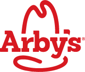
The Arby’s original logo isn’t only one of the most uninventive monogram logos out there, but it suffers from poor graphic design.
While the image is supposed to represent a cowboy hat, it’s somewhat phallic. This sends the wrong message about Arby’s’ brand identity as a family restaurant.
Bad Logo Example #5: Motorola
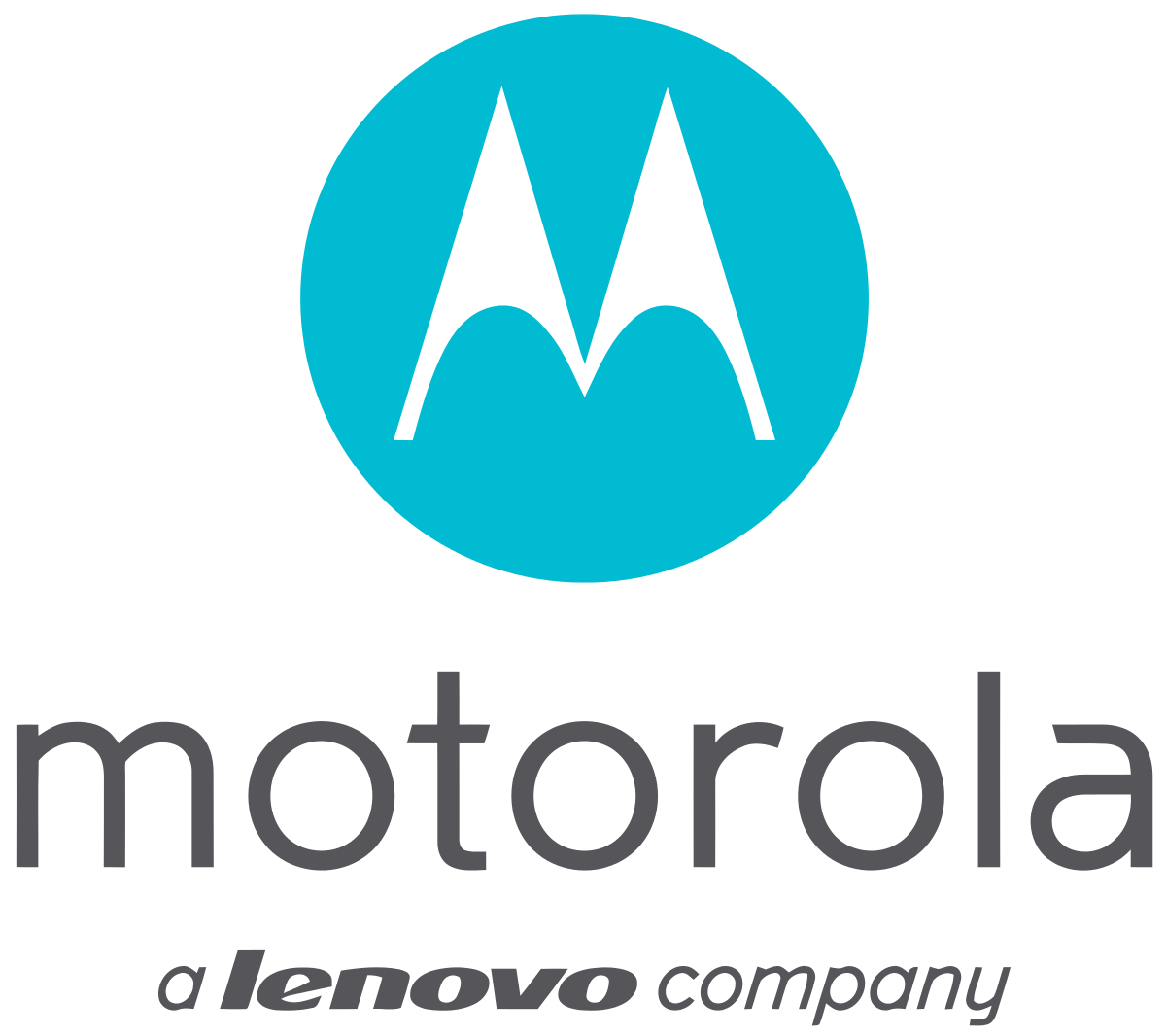
The Motorola logo redesign made a great font choice for the company’s name but fell down when picking the company’s logo.
The large ‘M’ has a ‘Batman-esque’ feel with odd proportions and contrasting curves.
This ugly logo doesn’t add any value to Motorola’s brand identity or increase brand awareness as it tells consumers nothing about what the telecommunications firm does.
Bad Logo Example #6: Verizon
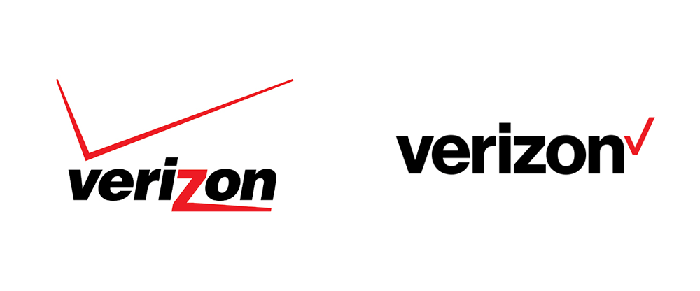
Verizon is another telecommunications firm with a terrible logo redesign.
While, again, the font choice is sleek and invokes clarity, the logo is pretty underwhelming. So much so, in fact, that John Legere, T-Mobile’s CEO, publicly mocked the redesign.
Verizon have dropped the most memorable graphic element from the original logo, which was a large red ‘Z’, instead replacing it with a check.
Not only is this yawn-invoking, red means no while a check means yes. This sends contradictory signals.
Bad Logo Example #7: Sony
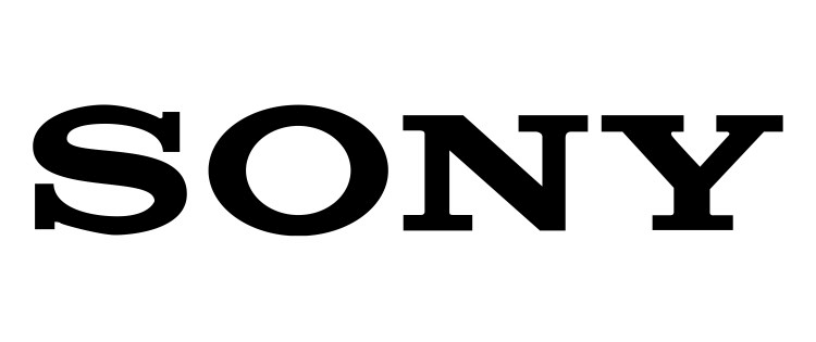
The Sony logo is another unimpressive graphic design feat. The logo hasn’t changed much from the original logo design, created in 1955. In fact, the current logo hasn’t even clinched a redesign since 1973.
The outdated slab font choice says nothing about the electronics brand, apart from its inability to join the current millennium. Its lack of creativity could speak wonders for Sony’s innovative capacities.
Bad Logo Example #8: Mitsubishi
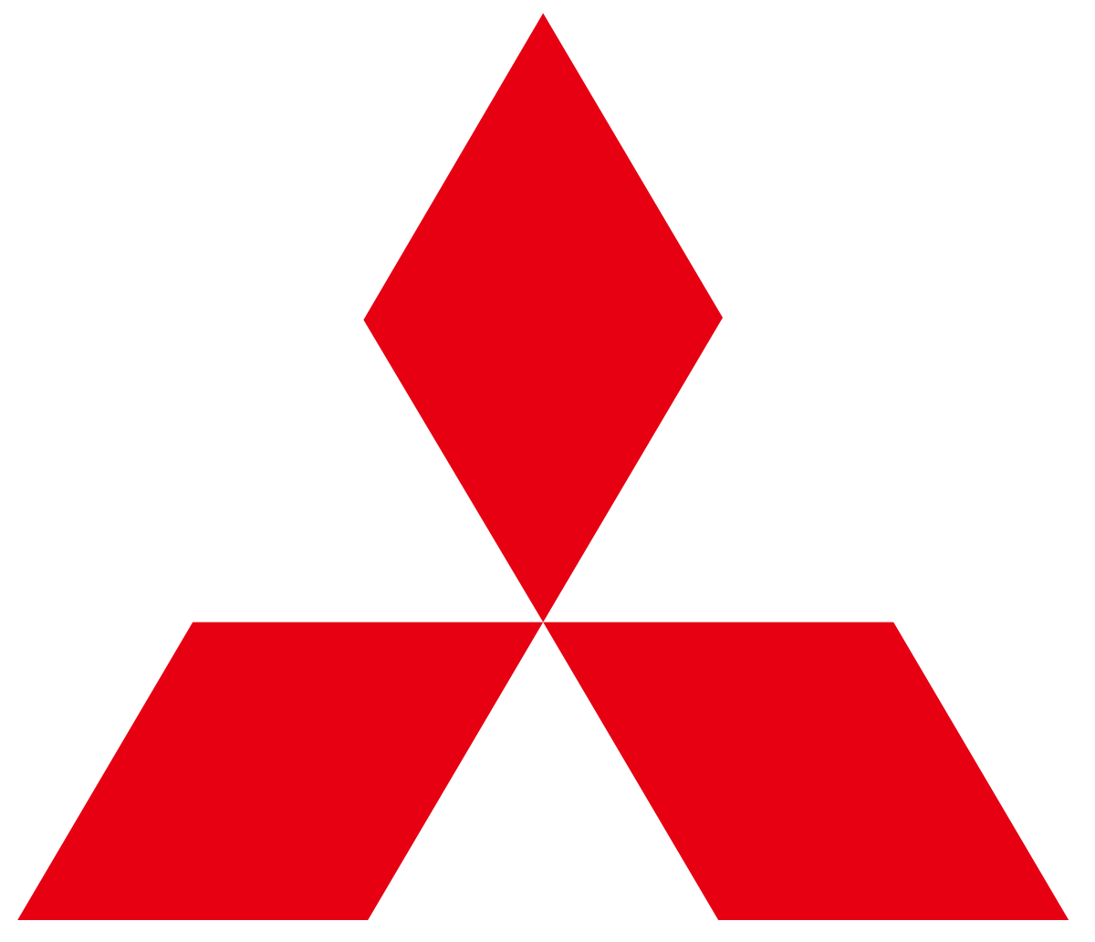
The Mitsubishi logo has an entire story behind it that largely goes untold. The three diamonds represent reliability, success, and integrity — the car company’s key principles.
But, this brand identity is lost with this bad logo, since the story isn’t common knowledge and the logo doesn’t allude to anything of this nature.
If anything, red is more of a warning color than the color choice for such regal and majestic attributes.
Bad Logo Example #9: Pepsi
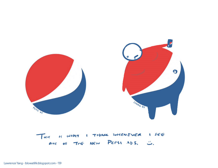
The Pepsi logo redesign was a tragedy. While the smooth feel was certainly an update to the old logo, it falls foul to brand identity misrepresentation.
When the redesign was launched, artist Lawrence Yang mocked the Pepsi logo by adding his own graphic design twists. By manipulating the image, Yang turned the Pepsi logo into a representation of the negative effects of Pepsi products.
The obese, pop-guzzling image is a blow for the new Pepsi logo.
Bad Logo Example #10: Starbucks
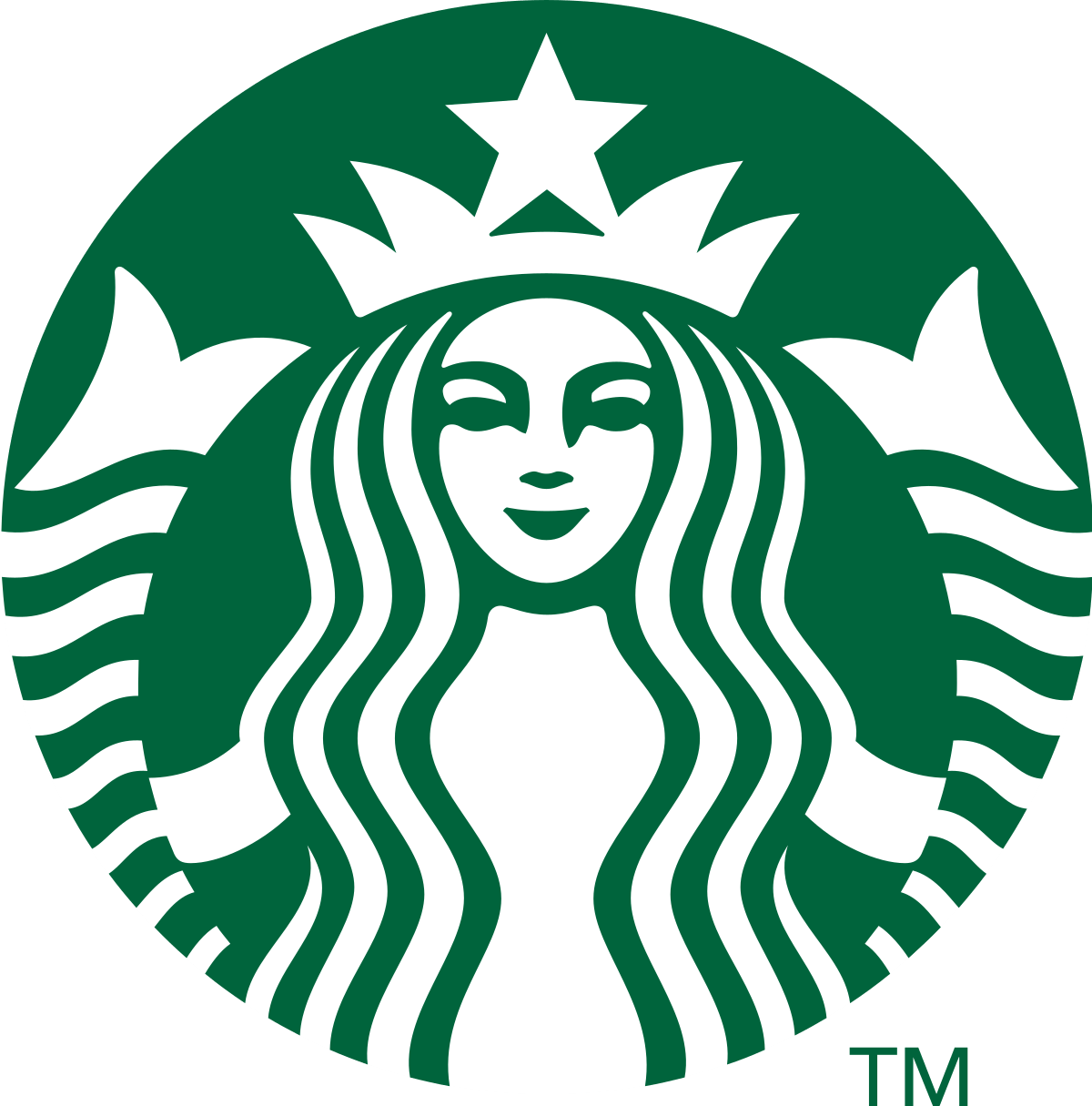
The Starbucks logo features a two-tailed Norse mythical mermaid, according to the coffee company.
Firstly, Starbuck is wrong about the origin of this figure — it is Melusina, the two-tailed siren from medieval mythology.
Secondly, Starbucks has no nautical connections. The idea of a siren in the logo makes consumers feel like the company is playing a trick on them.
Perhaps it is because Melusina is known for her alchemy, but Starbucks doesn’t mention this connection anywhere.
Bad Logo Example #11: Warner Bros

Warner Bros recently went through a bad logo redesign. Taking graphic elements from their old logo, Warner Bros are attempting to invoke nostalgia with this retro logo design.
However, the film company missed the mark. Instead, the stripped-back logo is, simply, forgettable. While the signature color choice aims to increase memorability and give the logo a modern feel, it just looks old.
Bad Logo Example #12: Asics
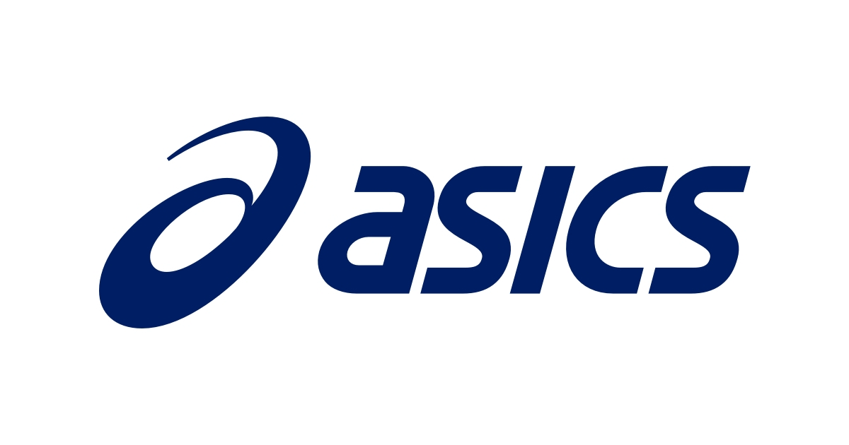
Sportswear brand, Asics, has an awfully confusing logo. If you’ve never heard of the brand, you’d presume the company’s name was ‘Oasics’.
The spiral graphic element is unnecessary as it adds no narrative to the brand identity.
The font choice is also a bit outdated, stuck in the late 80’s and 90’s. This terrible logo could benefit from a shake down and redesign.
Bad Logo Example #13: Chanel vs Gucci
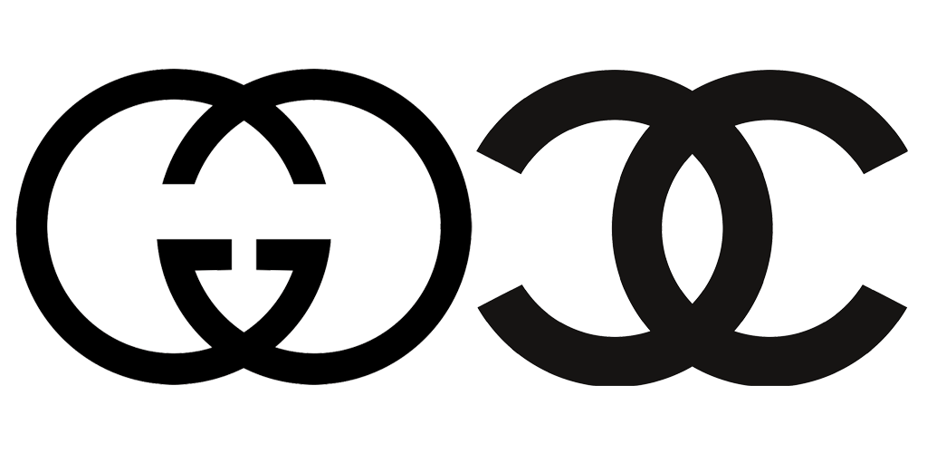
Gucci and Chanel are two the most famous high-fashion brands with two of the most similar logos on the market.
These logos are easy to mix up at a distance. Not only is the graphic design similar, the logo typography is also alike.
It’s surprising that two big brands would choose such unimaginative logos.
Bad Logo Example #14: Tokyo 2021 Olympics
 Champion
The Tokyo Olympics had to have a relaunch after COVID-19 led to the event being put off until 2021.
A few months back, a Reddit user captured this bad logo design image from a TV advert, showing the baffling new Olympics logo.
The official logo has been updated since this version as this design is extremely confusing. How do readers even pronounce 202ONE?
Not only that, the ugly logo is just too complex; there is so much going on with the addition of the NBC logo and the ornate ‘Tokyo’ font choice.
Famous logo designer Paul Rand had some negative things to say about using tacky content-specific fonts, stating that “to distort the letters of the alphabet in “the style of” Chinese calligraphy (sometimes referred to as chop suey lettering), because the subject happens to deal with the Orient is to create the typographic equivalent of a corny illustration.”
Bad Logo Example #15: Champion

Veteran sports brand, Champion, isn’t really championing good logo design with this outdated insignia. Not only is the font choice a bit tough to read, the color scheme and style need updating.
A basketball brand, Champion’s company logo simply doesn’t allude to the basketball culture with its script and navy blue and red palette.
Bad Logo Example #16: Byblos
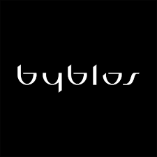
Byblos is a top Italian fashion brand, yet the Arabian-style font gives the impression of a different origin. This is a bit misleading at first glance.
Not only that but the font itself is a bit tacky and old-fashioned, harping back to late 90’s and early 2000’s font trends.
Since Byblos hasn’t chosen to spice up this logo in any other way, the fashion brand should consider a rethink on their font choice.
Bad Logo Example #17: UGG

Outdoorswear and high-fashion brand, Ugg, needs to update its old logo. While it sings of their origins in the outback, the company has largely transitioned from their rancher audience to serve more fashion-conscious clientele.
While the brand could keep their outback heritage in their font choice, a more modern typography would bring the company’s logo into the 21st century.
Bad Logo Example #18: Tide vs Ecos
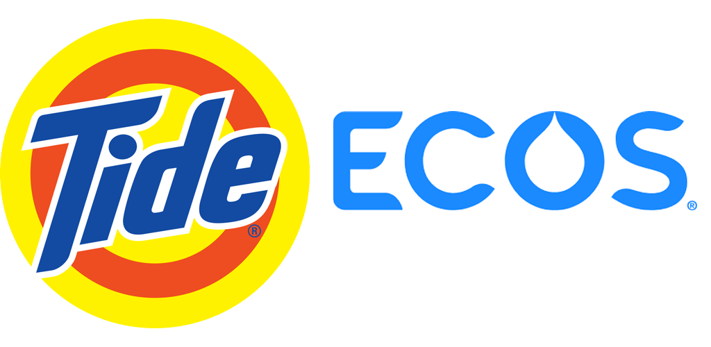
Tide and ECOS are both cleaning products brands.
Tide’s bright colors would have attracted attention back in the 80’s and 90’s, indicating how well they hit the target.
However, in today’s world, people value their health and environment more highly. Ecos channels this natural, healthy feel with a light blue palette and minimalist typography, giving a calming effect. The slight droplet-shape suggests cleanliness.
On the flipside, Tide’s outdated logo alludes to unnatural chemical cleaning with its stark color palette. While brand color choice can increase brand recognition by 80%, these color choices are memorable for the wrong reasons (like the warning stripes on a wasp!).
Conclusion
Don’t fall victim to terrible logo design.
Bad logos are confusing, outdated, irrelevant, and misleading. If you don’t want an ugly logo, steer clear of imitating other brands or using unclear fonts.
Instead, channel good logo design for your 2020 rebrand. Use simple yet unique design, that’s intriguing without being overpowering.
Leave out big taglines, but include your company name, and make sure consumers can identify your brand identity by being remarkable!