 Best SEO Companies
Nowadays people are dependent on Internet. They’re using laptops, netbooks, tablets, smartphones and even TVs to surf Internet. These devices have different screens and resolutions and it can be really hard to create website which works properly on all of these devices.
But there is a great solution for this problem. Responsive design is all about adjusting designs to accommodate screens of different sizes. If you want to create a responsive web design you should use fluid grids, images, and queries. In this post you will find 20 useful responsive design tools for creating responsive web design.
If responsive design is something you wish to learn more about, you can also view our list of 15 Best Detailed Responsive Web Design Tutorial on Design Woop.
Table of Contents
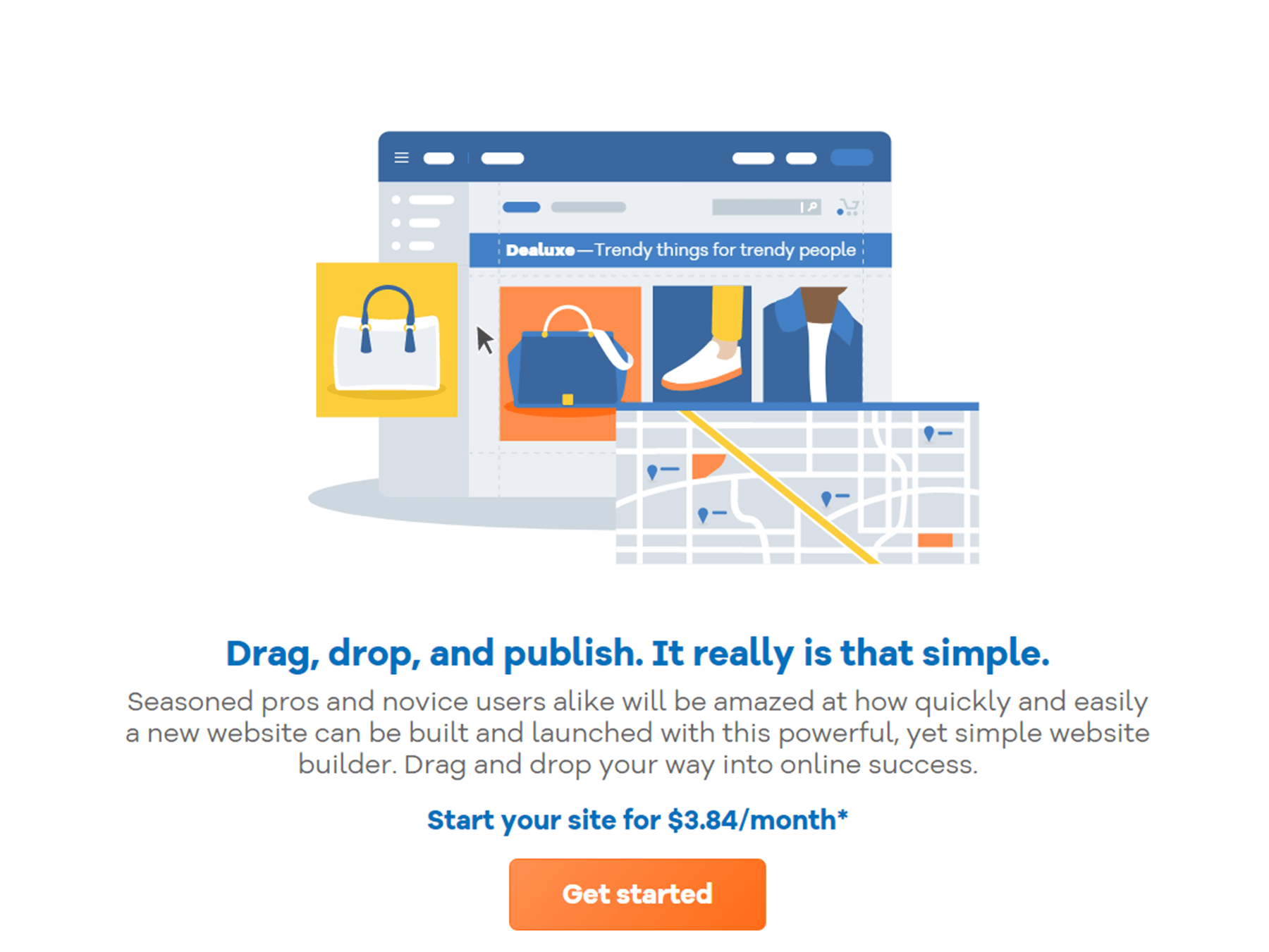
Gator Website Builder
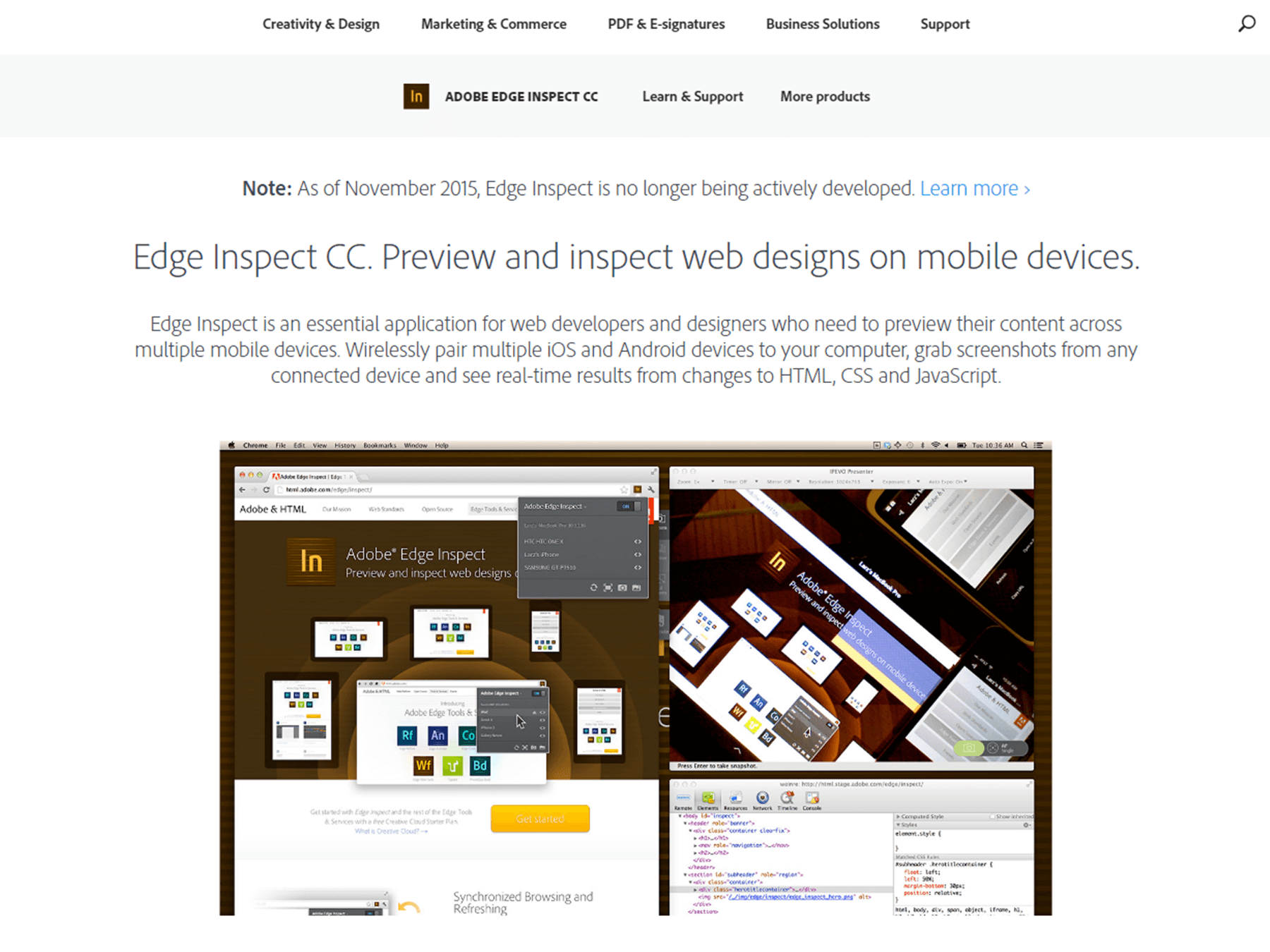
Adobe Edge Inspect
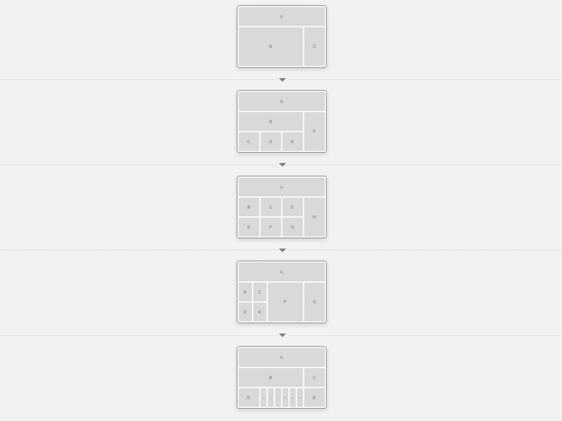
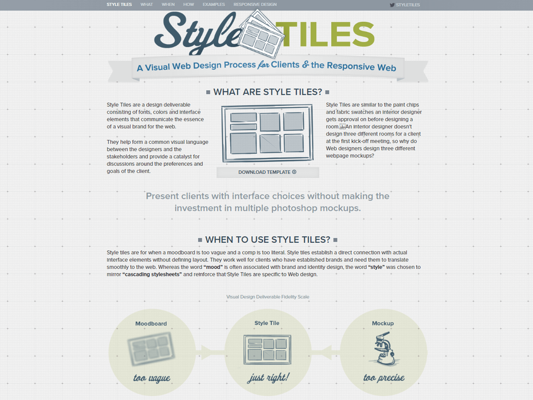
Responsive Wireframes
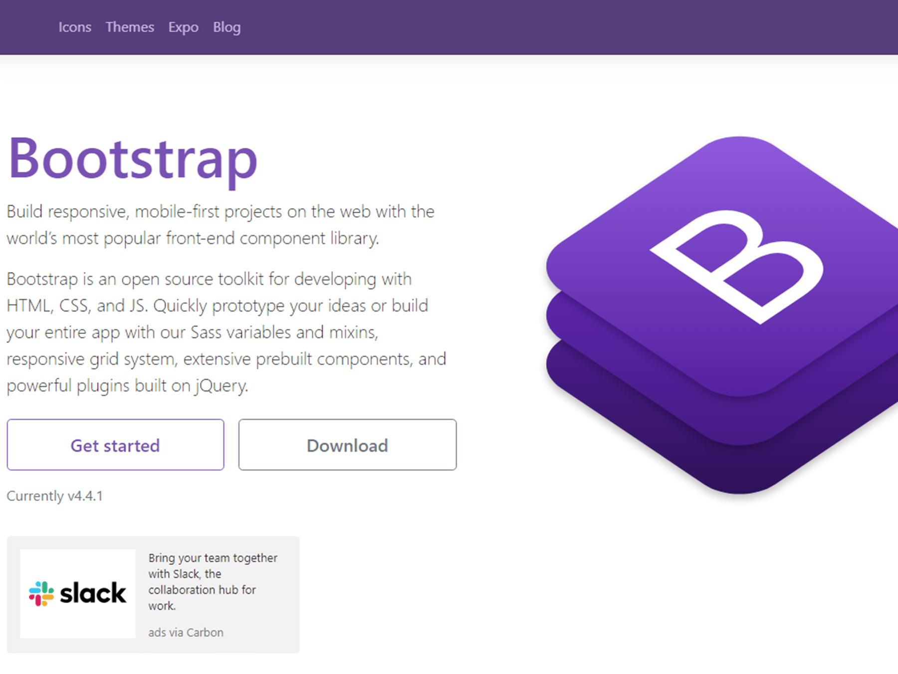
Bootstrap
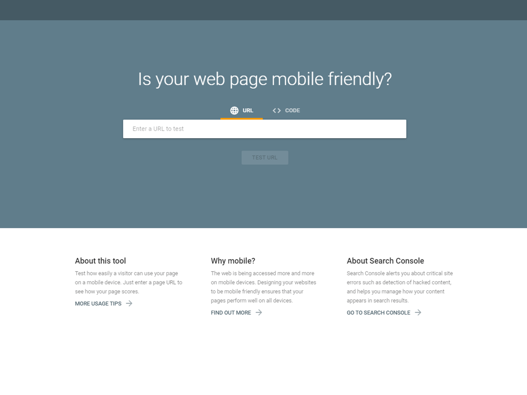
Google Mobile-Friendly Test
Responsive Design Tools
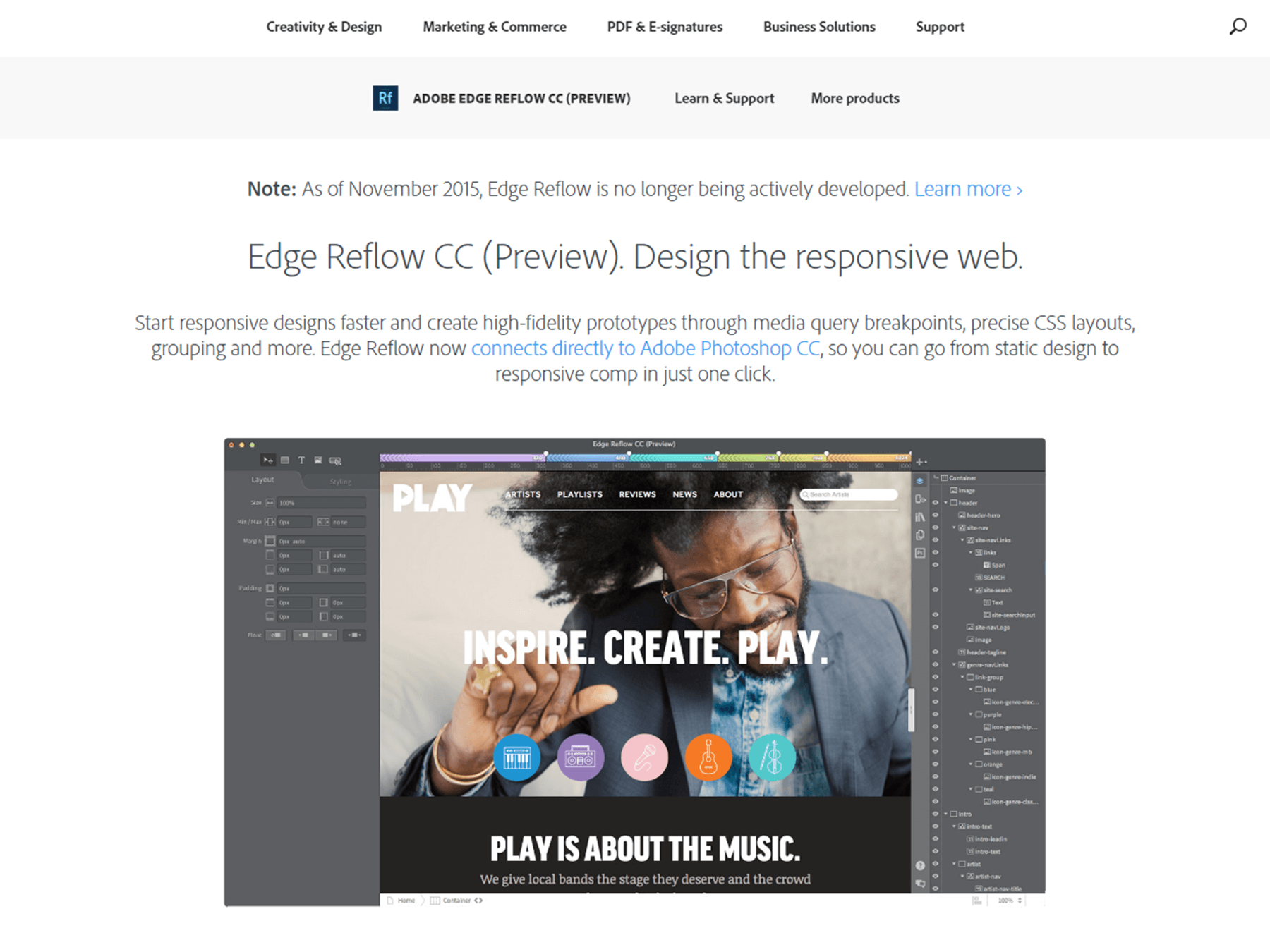
Adobe Edge Reflow
InVision

Export Kit

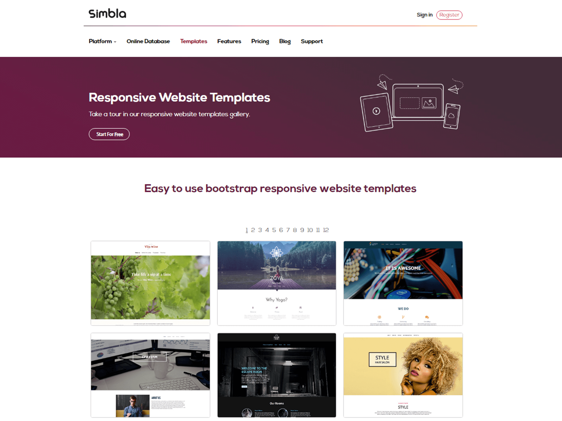
Simbla
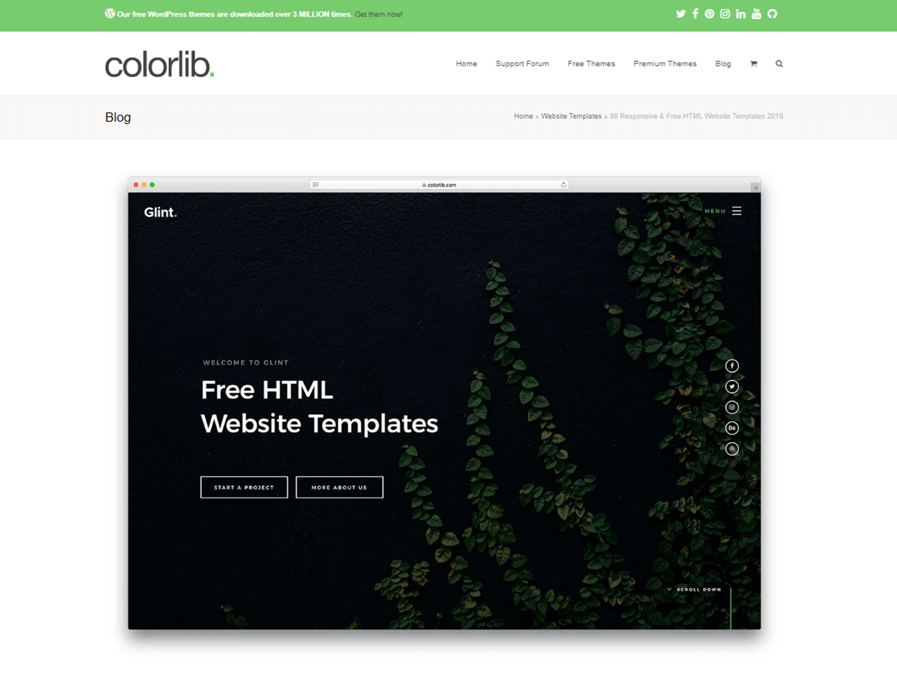
Colorlib
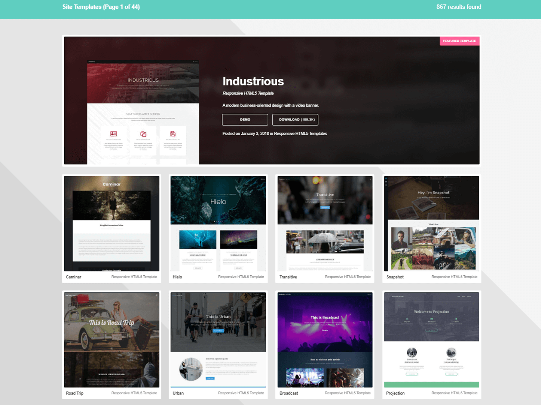
Templated
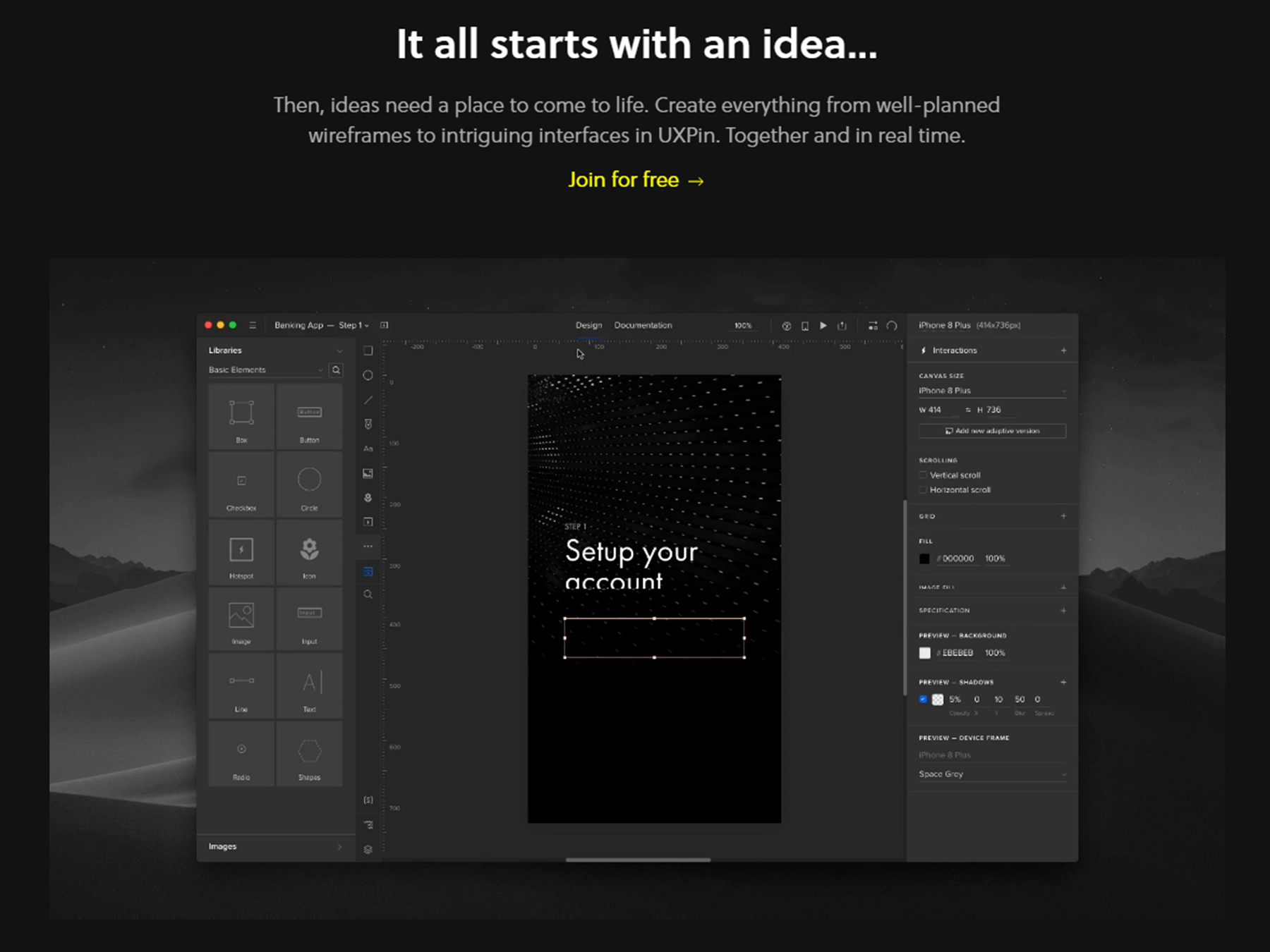
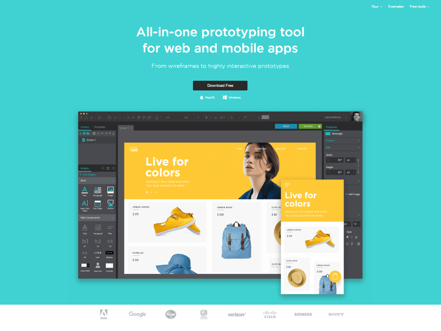
UXpin
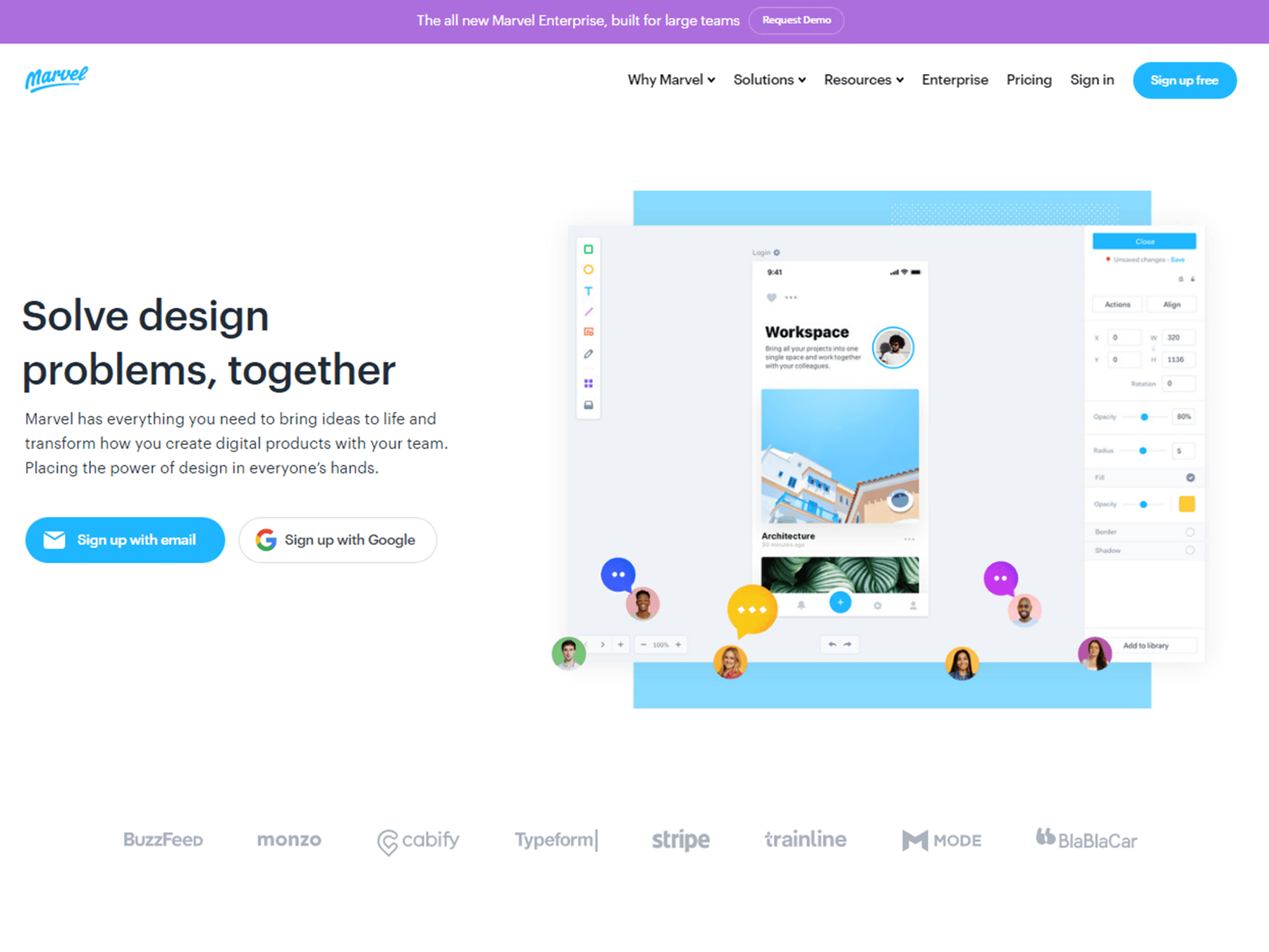
Marvel
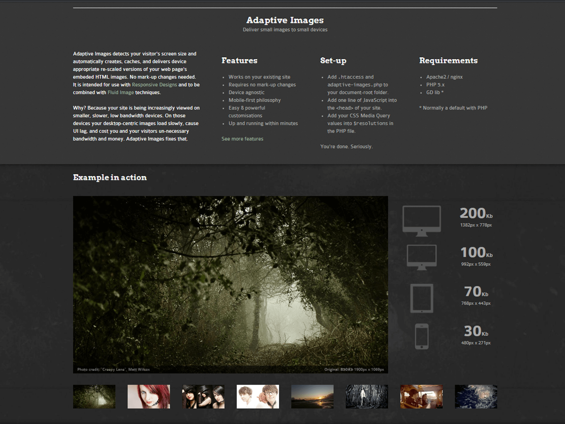
Adaptive Images
Justinmind
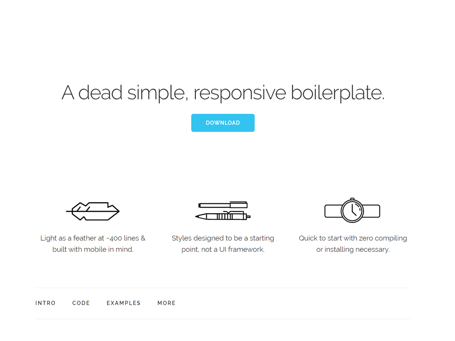
Skeleton
 FitText

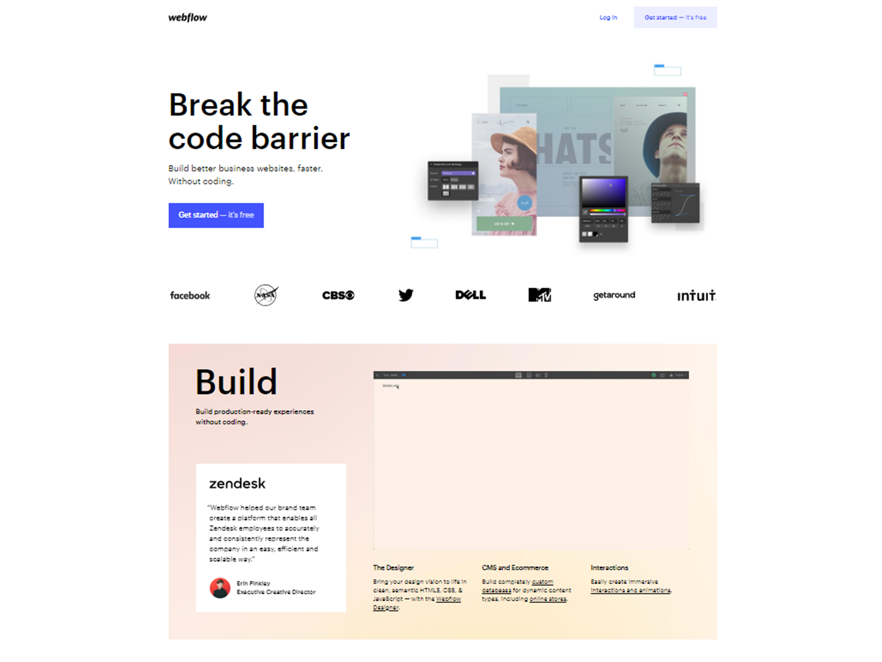
WebFlow
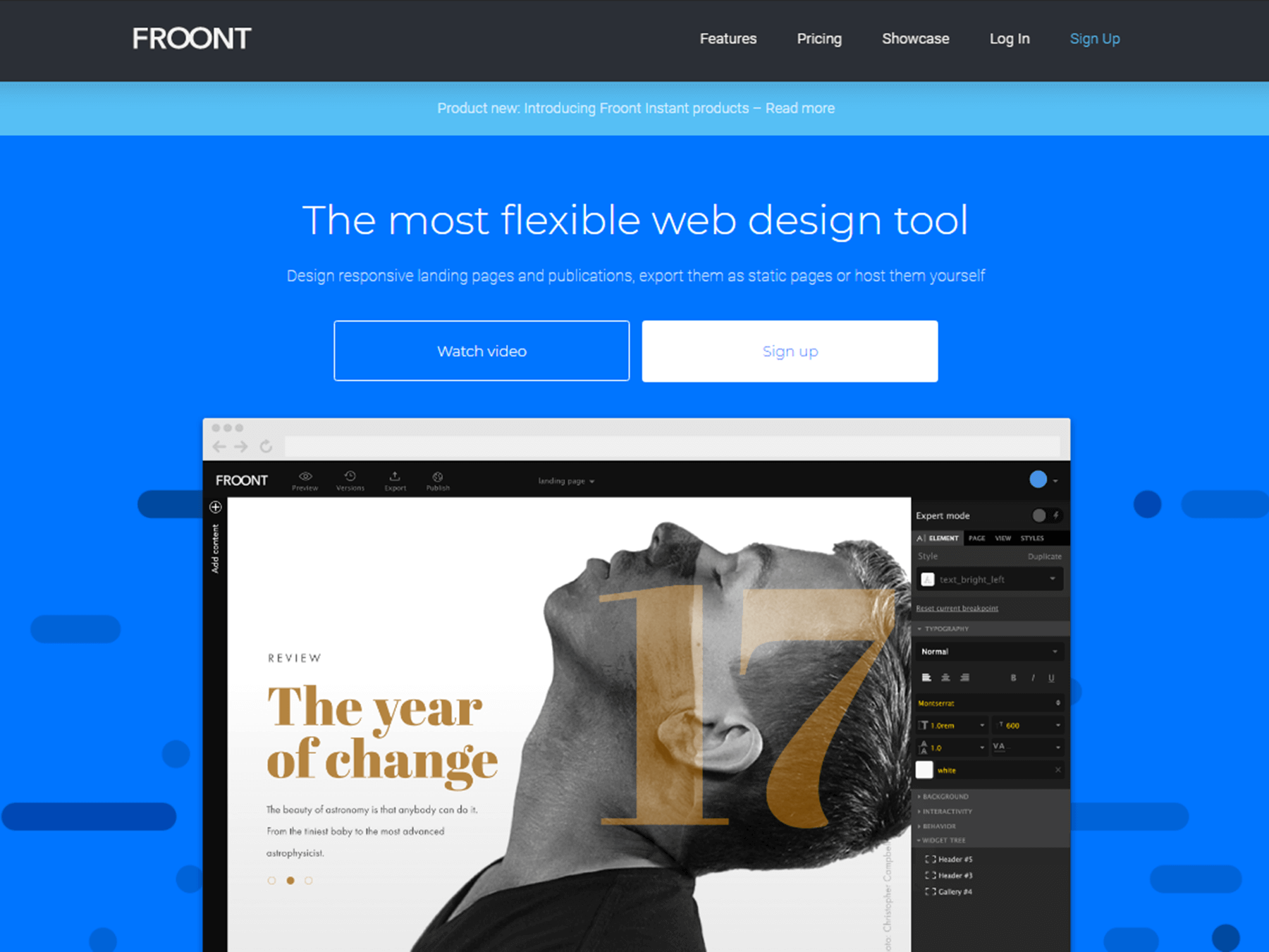
Froont
 Best SEO Companies