 Best SEO Companies
 WordPress
Your WordPress theme should use responsive design so visitors to your site that may have different browser and media sizes, such as iPads, iPhones and tablets can view your site correctly, without missing content and having to zoom in. Having a responsive design allows your website content to be displayed correctly to all users by using fluid grids, images and queries to adjust the design to accommodate screens of different sizes.
In this collection I have taken 20 of the latest and best responsive WordPress themes. Open the sites up and re-size your browser window and see what happens! And to learn even more about responsive design, also check out our List of 15 Best Detailed Responsive Web Design Tutorial on Design Woop.
Table of Contents
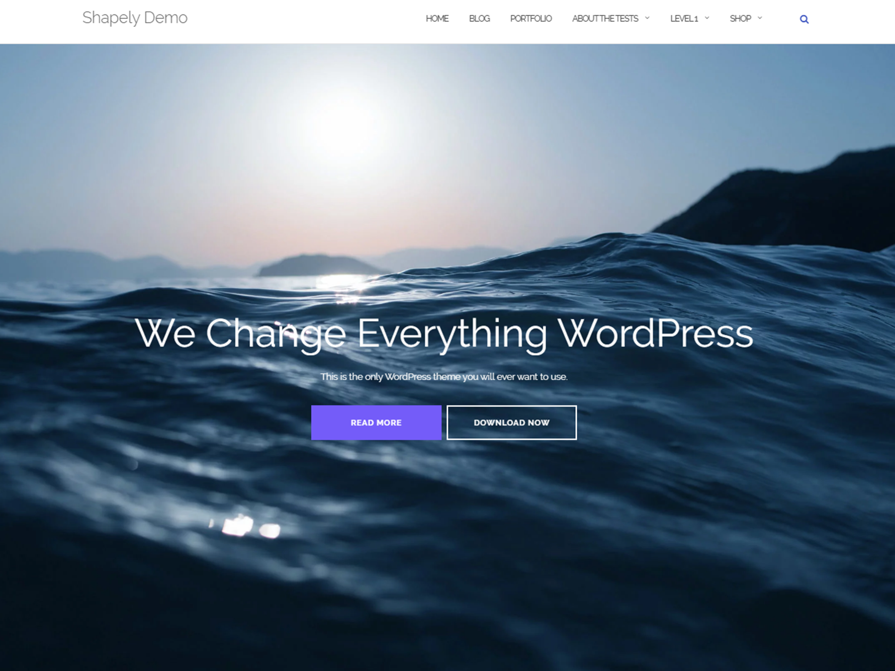
Shapely
Monstroid2

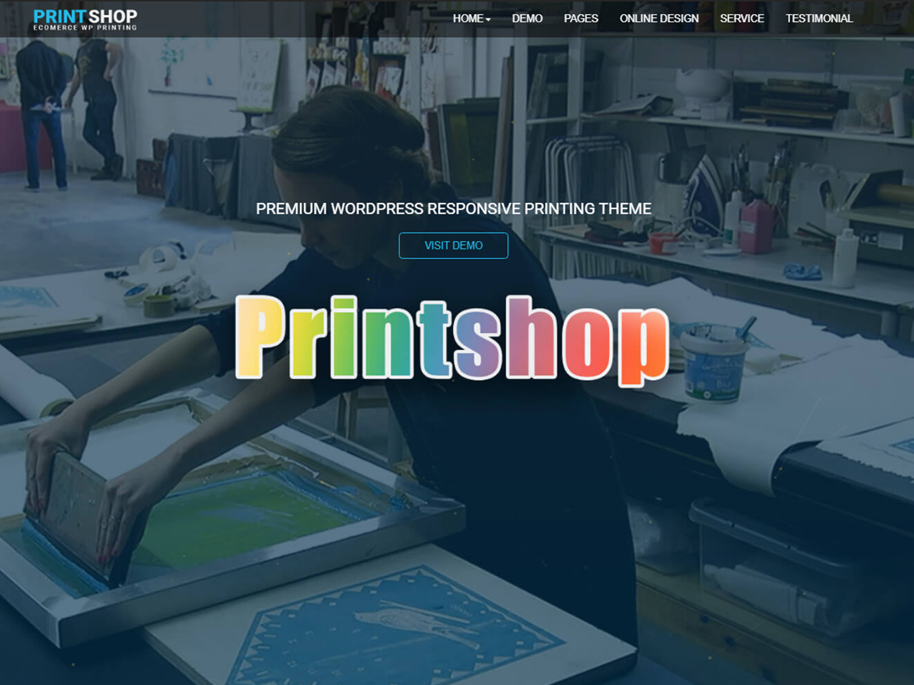
Printshop
Pharmacy WooCommerce

Hestia
Astra
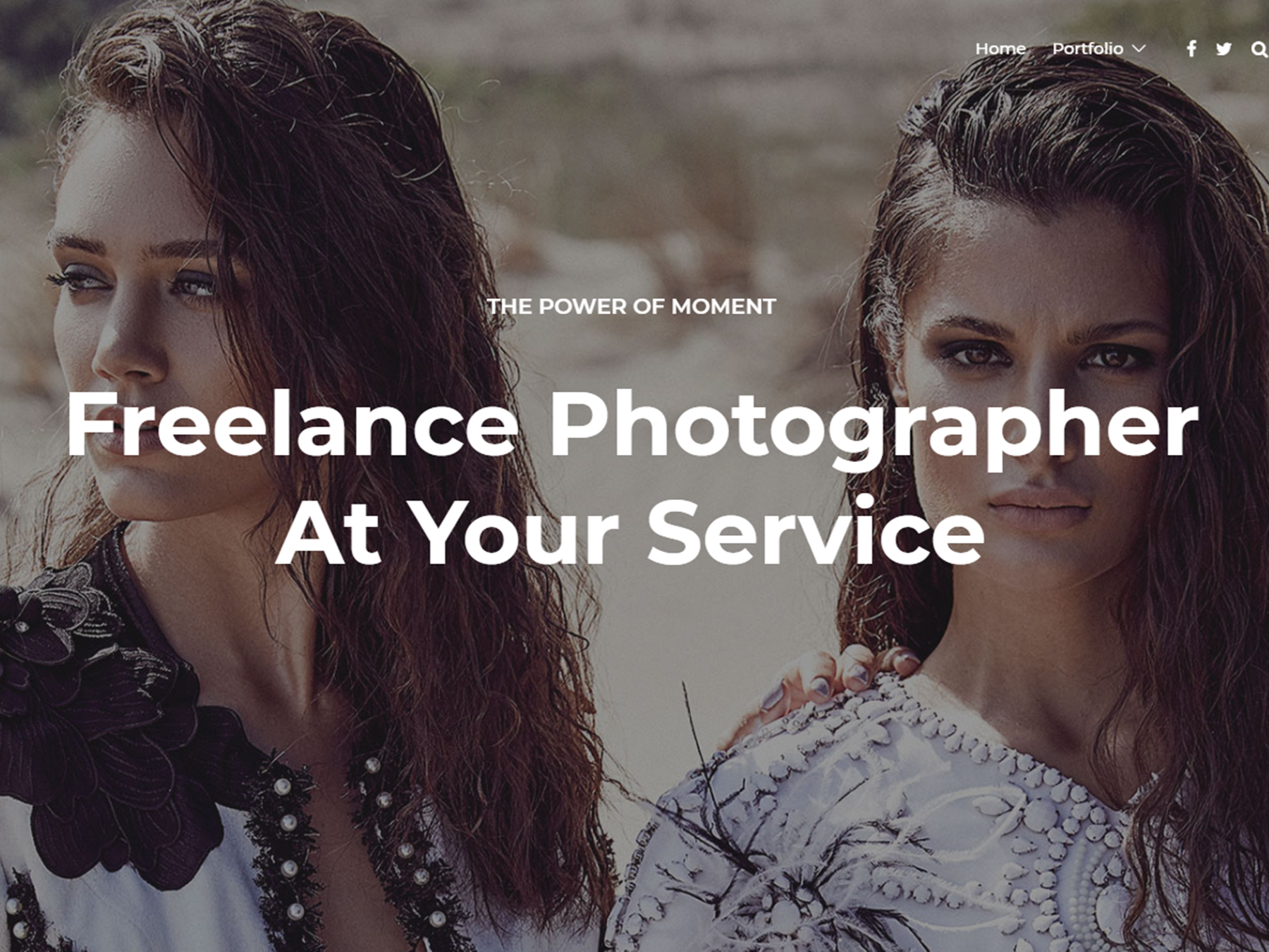
Jevelin
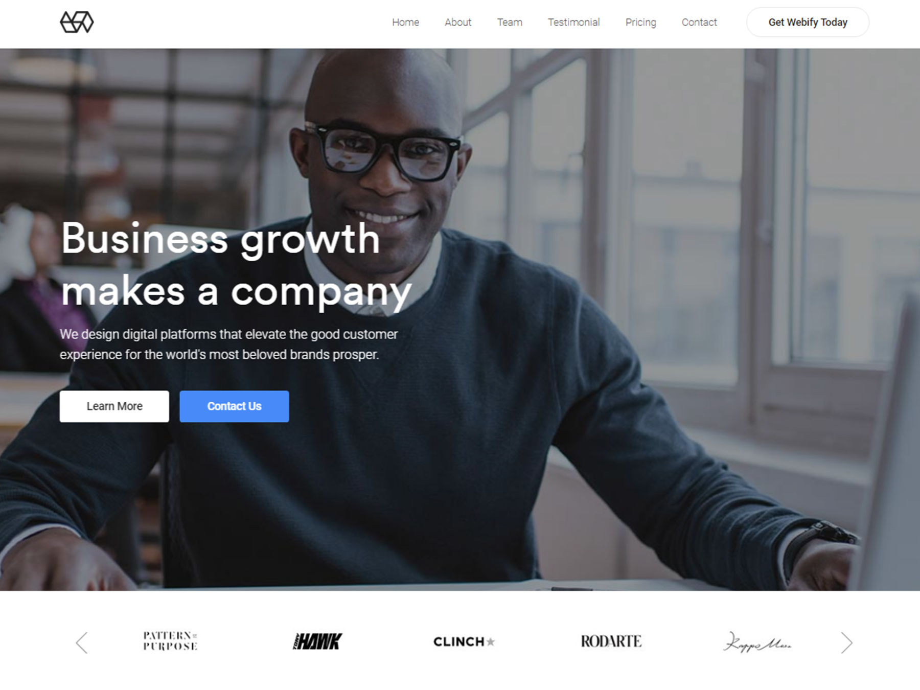
Webify
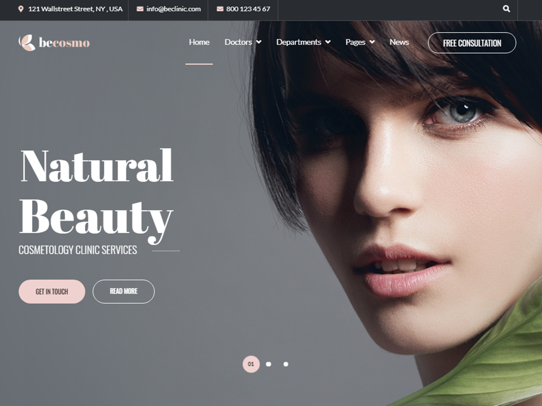
BeClinic
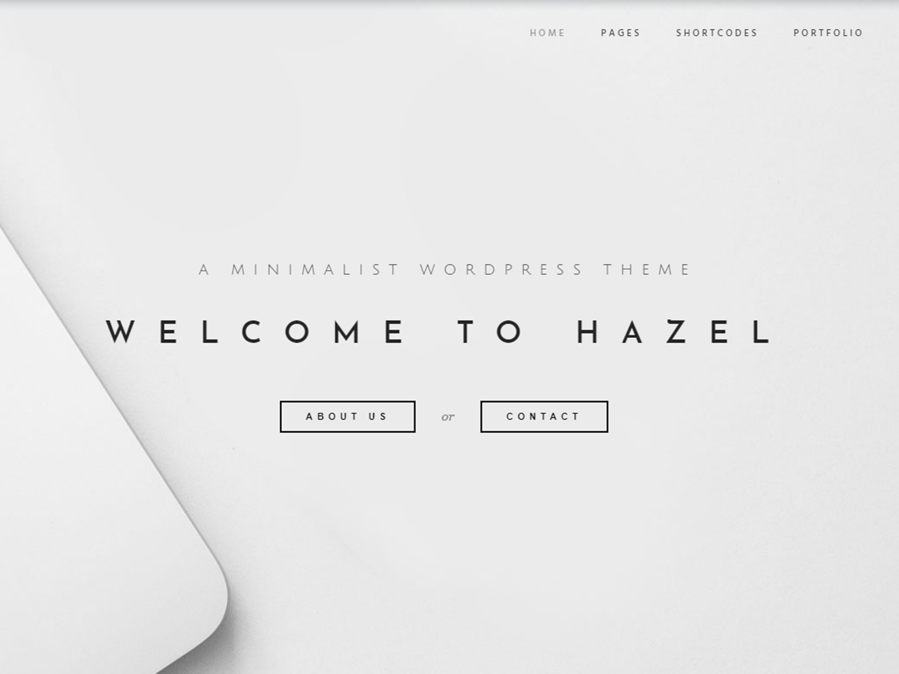
Hazel
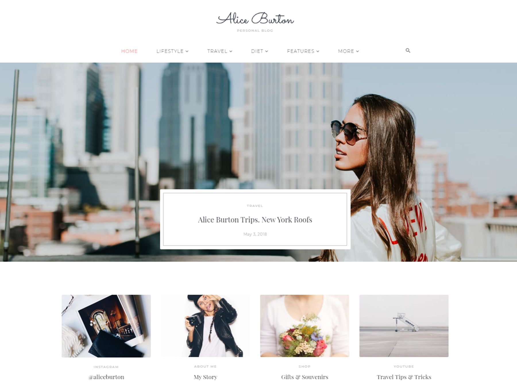
Storycle
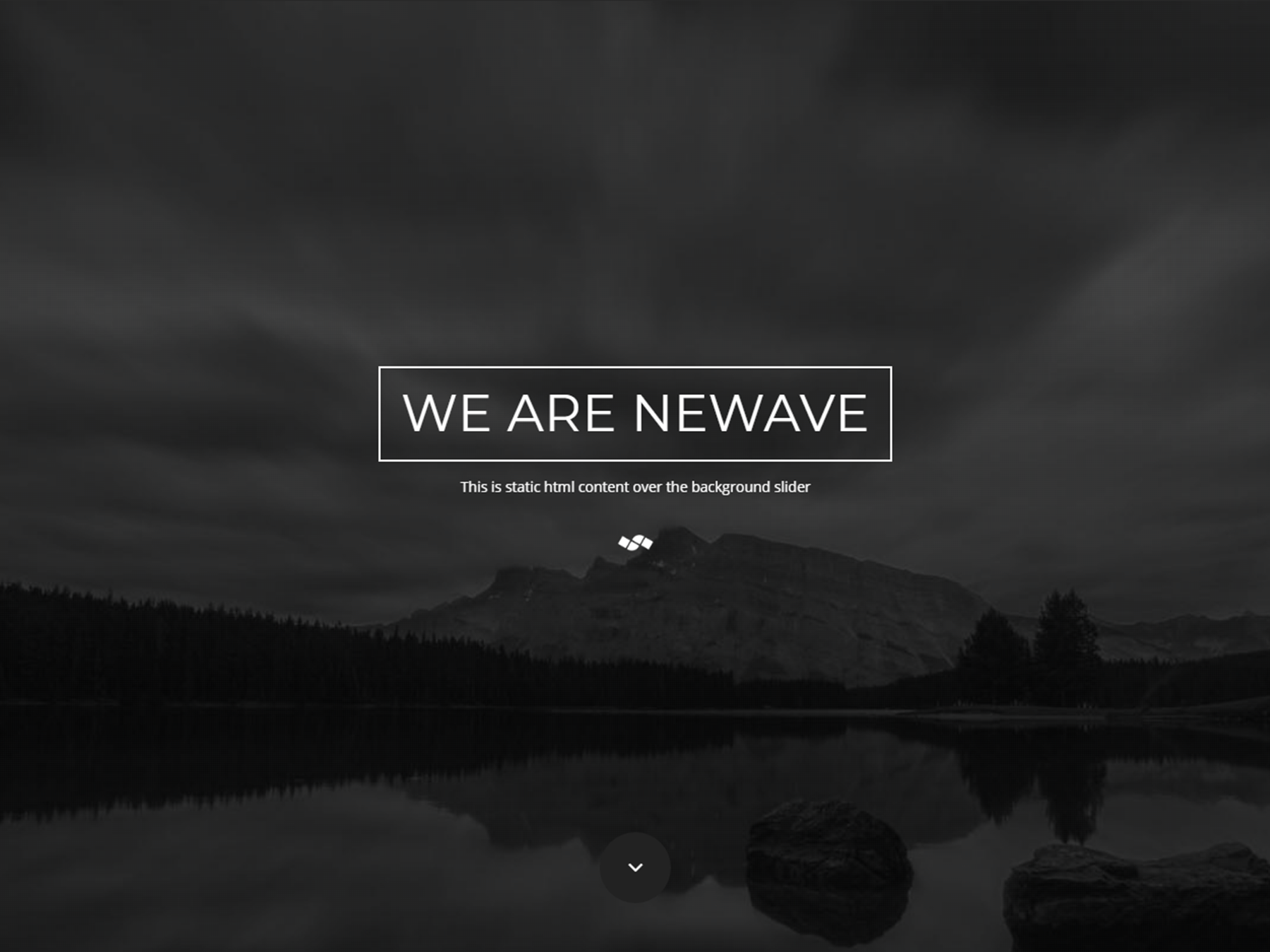
Newave
OceanWP
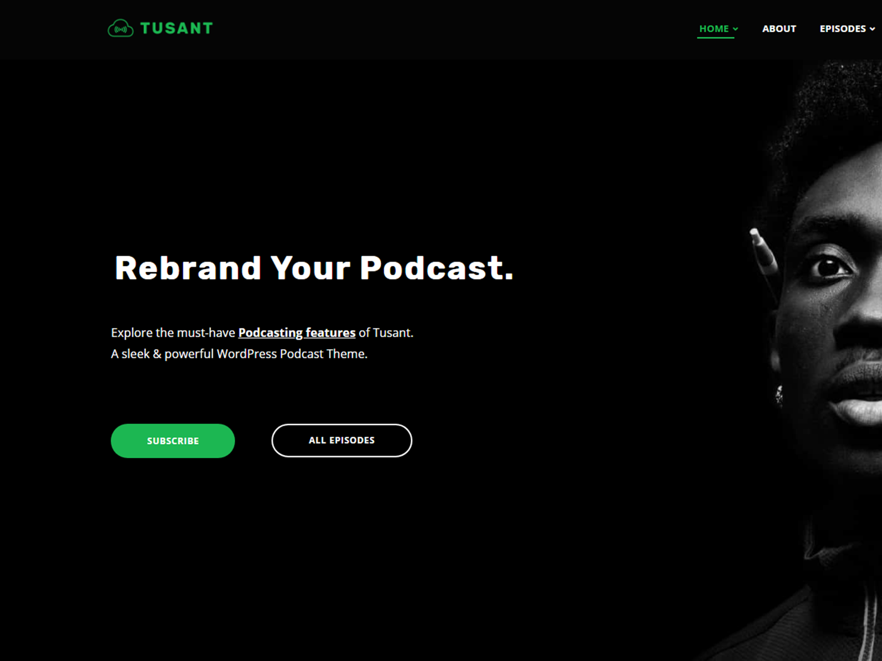
Tusant
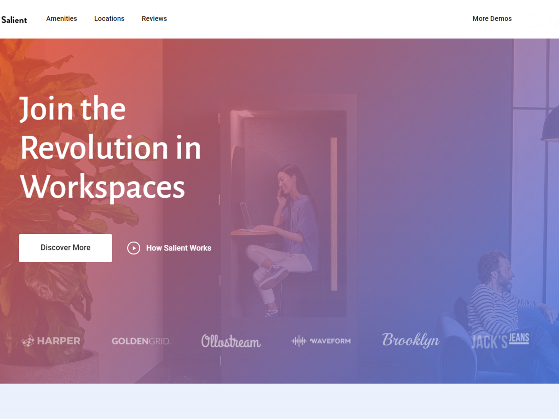
Salient
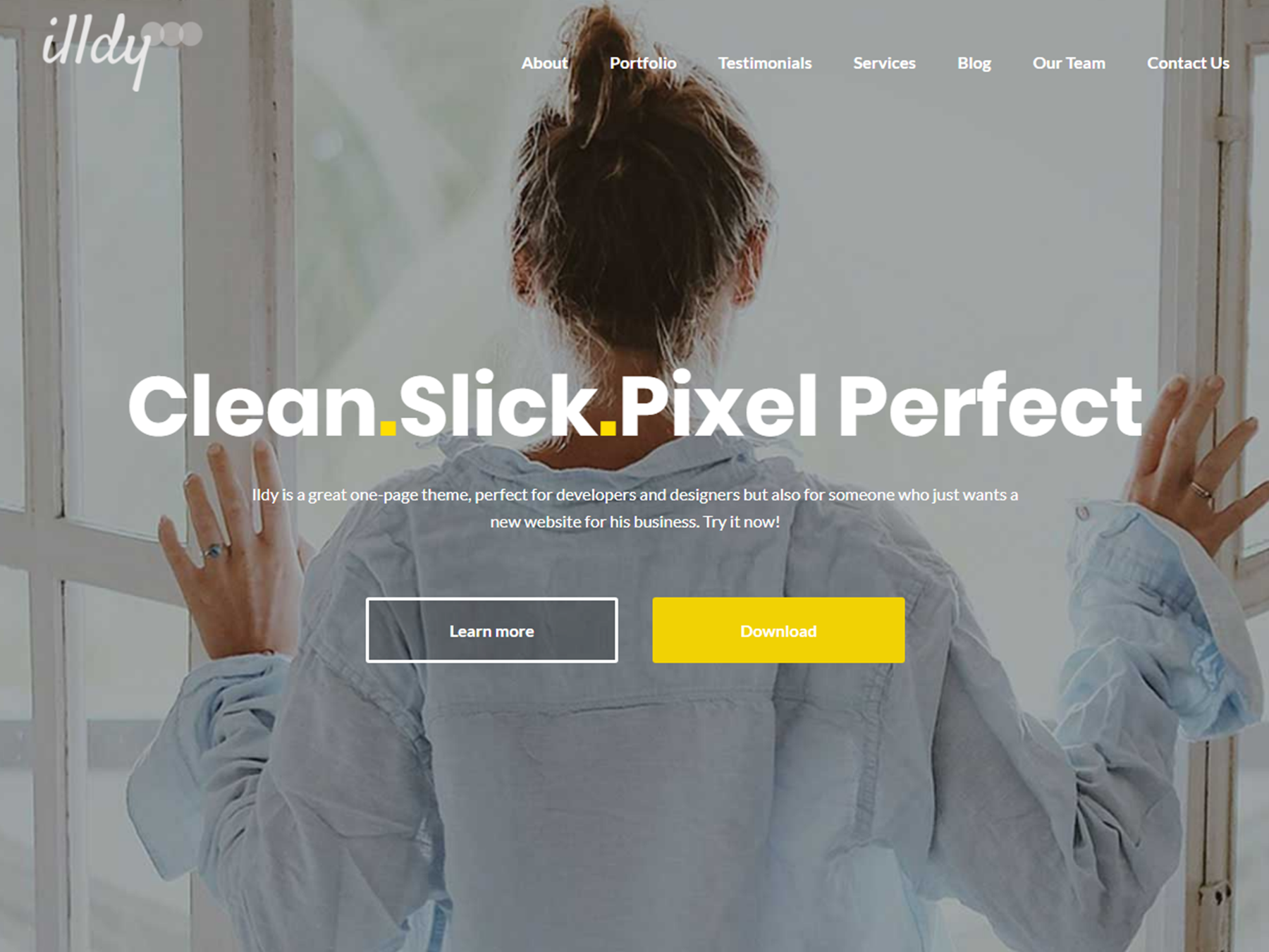
Illdy
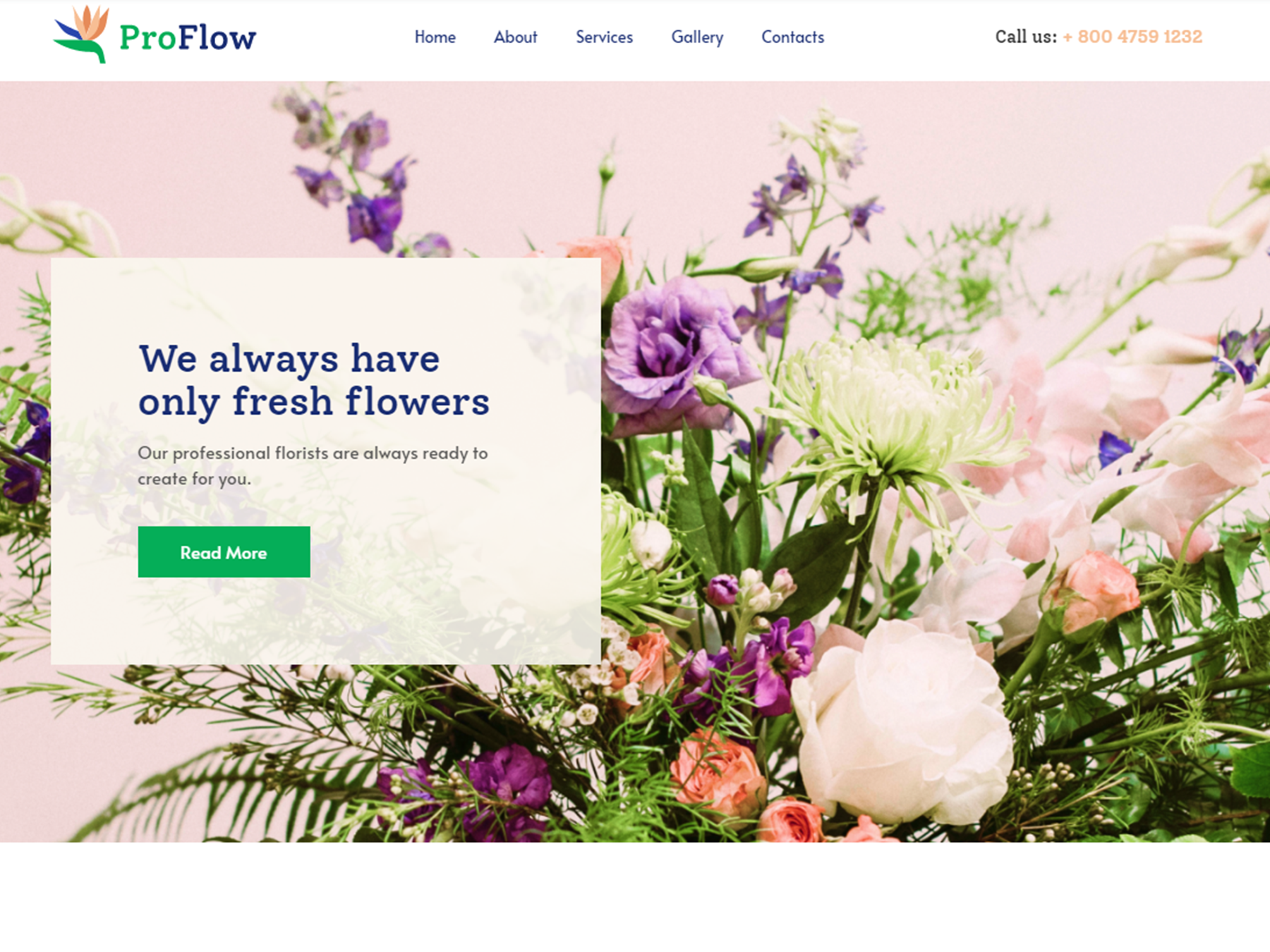
ProFlow
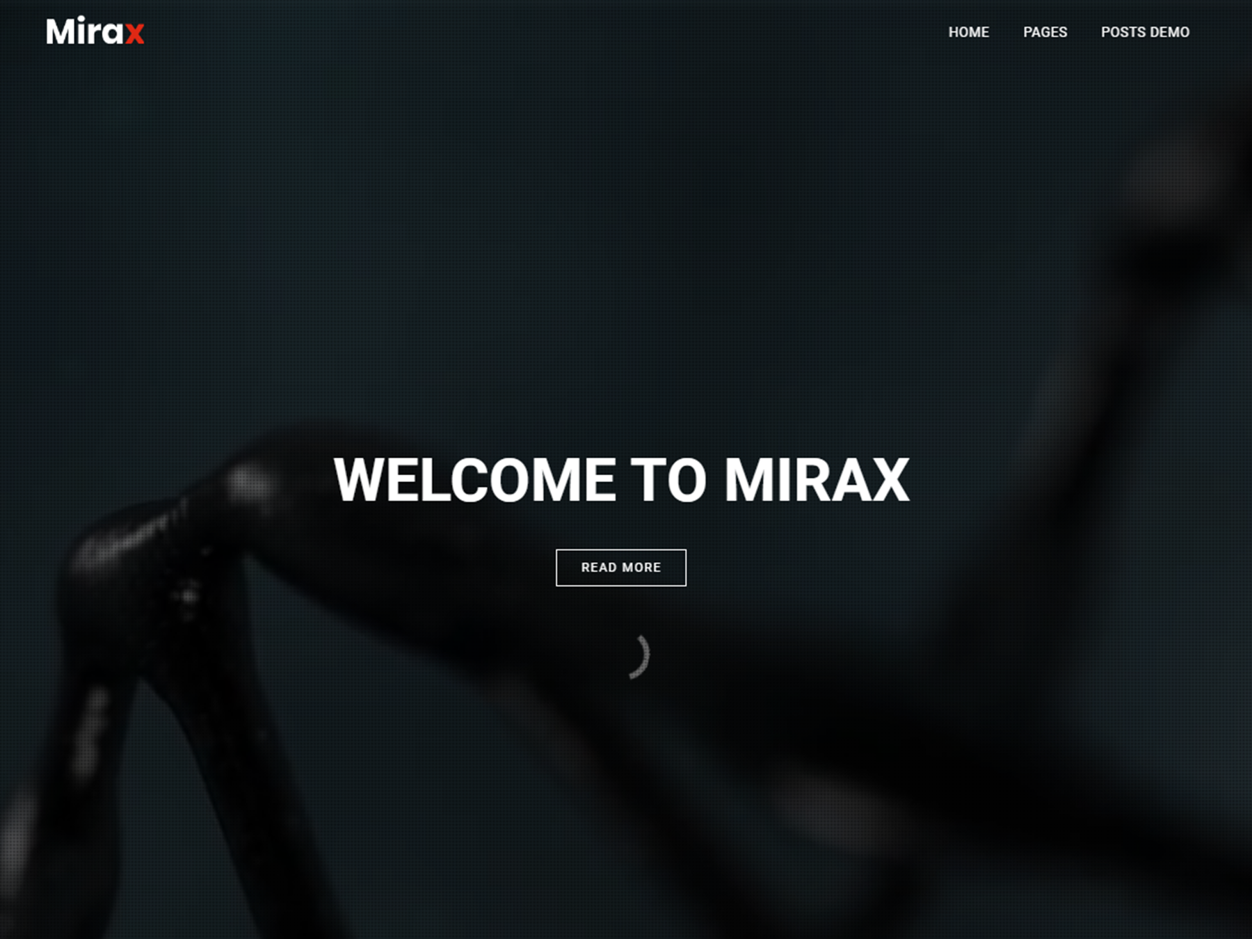
Mirax
Ultra
Float

 Best SEO Companies