It’s often said that “a picture is worth a thousand words,” but when it comes to some of the most recognizable logos around the world, a simple image can be worth so much more.
Whether it’s a piece of fruit, a simple swoosh, or a single letter, some logos have become so iconic, they’re recognizable all around the world for the smartphones, sneakers, and platforms they represent. In some ways, the revered icons have set a standard for the way other brands might think about marketing themselves. As one study found, people are more likely to shop somewhere they recognize the logo, and even more shoppers admit they wouldn’t shop with a brand that had a bad logo.
But what if some of the most recognizable logos in the world were reimagined? How would artists or designers recreate those logos based on the mission statements companies like Apple, Nike, and Facebook proclaim? With exactly that question in mind, we asked designers from all across the globe to recreate some of the logos of the world’s leading brands.
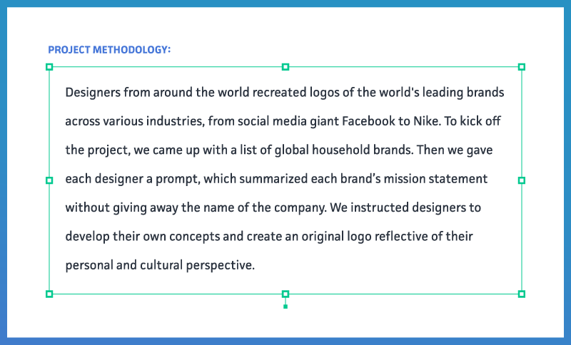
Without having the name of the organization for which they were designing, we asked this array of global creatives to imagine a new logo using just an excerpt from the company’s mission statement and to include their own personal and cultural perspective in their work. Here’s what they had to show us.
A Different Facebook Approach
Armed with the instruction to design a logo for a “social media brand” and a summary of the Facebook mission statement (that includes the social media giant’s aim to empower people to build communities and feel connected to others around the world), these are the logos six graphic designers imagined.

In Germany, one designer imagined a circular, repeating pattern reminiscent of an open eye. In contrast, designers in China and India embraced the more altruistic aspects of the abridged mission statement. The designers from both China and India imaged the generic “social media brand” logo to include an outstretched hand, both with the silhouette of a globe centered in the palm. The design from India was the only creation to imagine the logo for a social media brand in a color other than blue, with accents of red for the outstretched hands. In China, the designer imagined the logo more circular (akin to the actual Facebook logo), while the designer from India encompassed the use of vertical lines as well.
In the United Kingdom and the United States, both designers leveraged the shape of people as the most recognizable elements of their creations. In the U.S., the social media brand was abbreviated to SMB (the only country to do so), with the likeness of two people centered between cupped hands. In the UK, the design also employed a global centerpiece, along with a trio of silhouettes to convey a social media brand.
In Peru, we found a more unique take on the social media brand. Like all of the other logos, the icon created by a designer from Peru also utilized shades of blue for coloring, but the design also employed a clear, smiling face for the logo.
The Apple Difference
In a country full of truly iconic and recognizable logos, Apple’s side-silhouette of its namesake with a simple bite taken out of it is possibly the most recognizable logo of all. In 2010, one retail location (the “glass cube” store in Manhattan) was identified as one of the most photographed locations in all of New York City. The Apple logo has changed considerably over the years (the first version also included an image of Isaac Newton), but Apple adopted the current icon in 1977 and has only made changes to the hues and shading ever since.
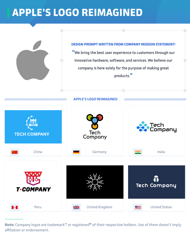
When asked to design a logo for a generic tech company using the mission statement, “We bring the best user experience to customers through our innovative hardware, software, and services,” it’s possible the Apple logo wasn’t the first icon that came to mind for these creators. Instead of the minimalist simplicity found in the Apple logo, these designers employed the use of color in most of their reimagined logos and considered imagery that more closely related to technology.
In China and India, we found designs were styled with blue as the primary color scheme, with the use of more abstract shapes to accompany the name “Tech Company.” In China, the design included a solid blue background, while the logo in India employed a blue gradient within its abstract shapes. In Germany, we found four colors on display, perhaps more reminiscent of the Microsoft logo than the Apple design. Only in the UK and the U.S. did we find designs for this generic tech company void of color, and, in the UK exclusively, the icon was designed without the addition of the company name.
Coca-Cola Recreated
Unlike many of the other most recognizable logos from around the world, the beverage company Coca-Cola uses a wordmark as it’s emblem, and more people recognize that wordmark than could successfully spell the brand’s name. Even fewer consumers know what the name means, even if they have no problem recognizing the bold name and vibrant red imaging wherever they go.
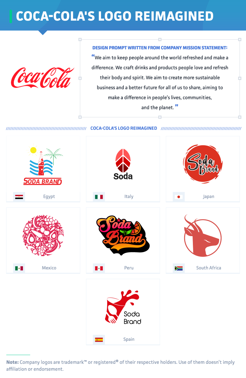
When we asked designers to reimagine a logo for a generic soda brand whose mission statement included the sentiment to “keep people around the world refreshed,” each one of them utilized the color red in their creation. Just two designers, from Mexico and South Africa, opted to forgo any text in their designs. In Mexico, the logo utilizes the silhouettes of various foods atop a matte red field. In South Africa, the designer imagined a soda brand logo to include the silhouette of an animal, possibly a gazelle or an antelope, to convey the “fictional” company.
In Egypt, the designers incorporated the classic image of a bottle with red liquid along with the moniker “Soda Brand,” also colored in red. In Italy, the designer opted to abbreviate the brand name to simply “Soda” but still relied heavily on shades of red for the final image. Only in Peru and Egypt did we find logos that used a color other than red, white, or black in the logo designs.
Remastering the Nike Logo
Perhaps no single icon is as synonymous with sports and sportswear as the Nike swoosh. As simple as it is bold and compelling, Nike as a brand may be worth billions of dollars around the world, but the iconic logo itself cost a mere $35 in 1971.

But what would a major “sports apparel brand” logo look like if it were reimagined with an international flair? Compelled with a mission state to design something that represented “inspiration to athletes around the world,” two colors dominated designer submissions: red and black.
While a majority of the designs utilized to represent a major sports brand included solid lines and bold fonts, the designer from Egypt used an image of an eagle in flight, with the acronym SAB in a red oval. In Japan, the name “Sports Apparel Brand” appears in a simple vertical font, outlined within a black box with a large red circle (reminiscent of the national flag of Japan). In South Africa, the word “Sport” appeared to dominate over “Apparel Brand,” accompanied by a black lotus flower. In Mexico, we found the most abstract design of all, and the only reimagined logo to omit the brand name altogether.
Marketing That Just Works
It’s hard to imagine the Apple logo without its iconic bite or the Coca-Cola logo as anything but a wordmark in that legendary red font. As we found, some elements of these truly classic designs are synonymous with the idea of a social media brand or a soda company. Across the world, these designers put a unique spin on these recognizable concepts, bringing elements of their own culture and perspective into the simple, but still thoughtful and creative, approaches.
When you’re building a marketing strategy, it makes sense to go with what works. At Best SEO Companies, we’ll help you find a reliable SEO partner for your business using our proprietary ranking methodology (a secret blend of backlink quality scores, quality clients, company rankings, and more). SEO optimization isn’t a one-size-fits-all approach, and our mission is to help you find an agency that fits your needs. No matter what industry you’re in or what your goals are, Best SEO Companies was created to help businesses make better choices when selecting search engine optimization vendors. See the results for yourself by visiting us online at BestSEOCompanies.com today.
Fair Use Statement
Could your readers place the original inspiration for these new logo designs? Find out by sharing the results of this study for any noncommercial use by simply including a link back to this page in your story as credit to our creative team and these talented designers.